

The essential question that every brand must answer is “Who are we to our customer?”
Each aspect of your brand, from your mission and vision, core values, and products or services to your visual assets, website, social media style, etc. should help answer that question.
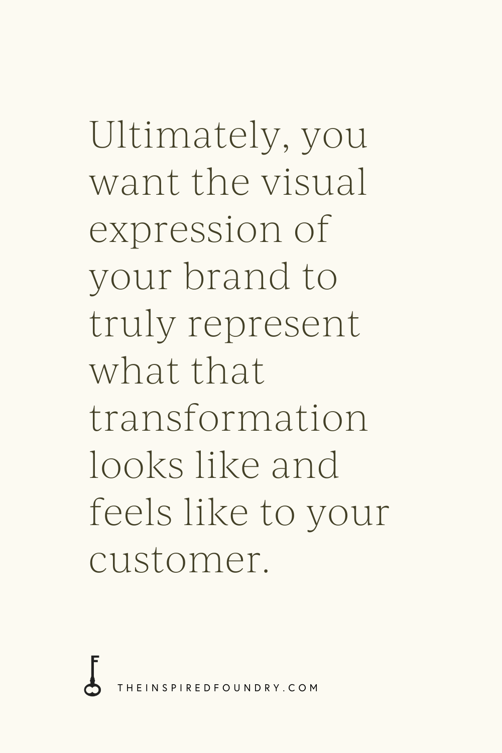
You are in business because you want to make an impact on someone, right? It doesn’t matter whether the impact is large or small — any transformation you’re offering in the life of your customer is a big deal. And ultimately, you want the visual expression of your brand to truly represent what the dream of that transformation looks like and feels like to your customer.
So, how do we craft a brand to communicate that potential impact?
To be honest, every aspect of a visual brand should be communicating that impact. But for this post, there are two specific and probably the most obvious aspects of a brand I want to discuss: vibe and color.
Much of what makes great brands stand out is subconscious. We don’t look at a specific color and think, “Oh this color should make me feel x, so now I will feel x.” It all happens without our awareness, which is why it’s easy to create a brand that doesn’t actually communicate your impact if you’re not considering how your color choices and overall vibe will truly make your audience feel.
Visual branding can also be tricky because (I personally think) a lot of it is subjective. One person might feel a certain way about the color blue, while other people feel completely differently about it. One designer might go one direction while another designer would take a completely different approach.
I’d also go so far as to suggest that many brands who currently have an established position in the marketplace have created associations in our minds by using certain colors, like using the color blue as a reference to stability, loyalty, and reliability. Color psychology says those things are true about the color blue, but which came first, our subconscious associations or marketing to our subconscious associations?
That’s why you see blue used for financial institutions, car companies like Ford, or even the branding for our new government administration. Their aim is to help us associate their brand with those feelings by choosing colors that will evoke the feelings they want us to have.
We can bypass this subjectivity a little bit by getting to know our audiences super well. If we know how our intended customer thinks, feels, and acts, we have a much better chance of creating a visual brand that will resonate with them, regardless of how someone who is not in our intended audience would feel about it.
Let’s talk about vibe first.
VIBE
Your brand vibe is your style, your brand’s character, the tone you want to give off, the way you want your customer to feel when they interact with you.
The fastest way to determine your brand vibe is to think of your brand as a person, or perhaps a celebrity. What would your personified brand wear? Where do they shop for clothes? Where is their preferred vacation spot? How do they talk? What would their home look like? What kind of music do they listen to?
If you already have an audience persona or ideal client profile, or just a general picture of who you’re trying to attract, those details can be helpful in determining your vibe, too. Ideally, your personified brand and your ideal client persona (after they’ve worked with you) should match up.
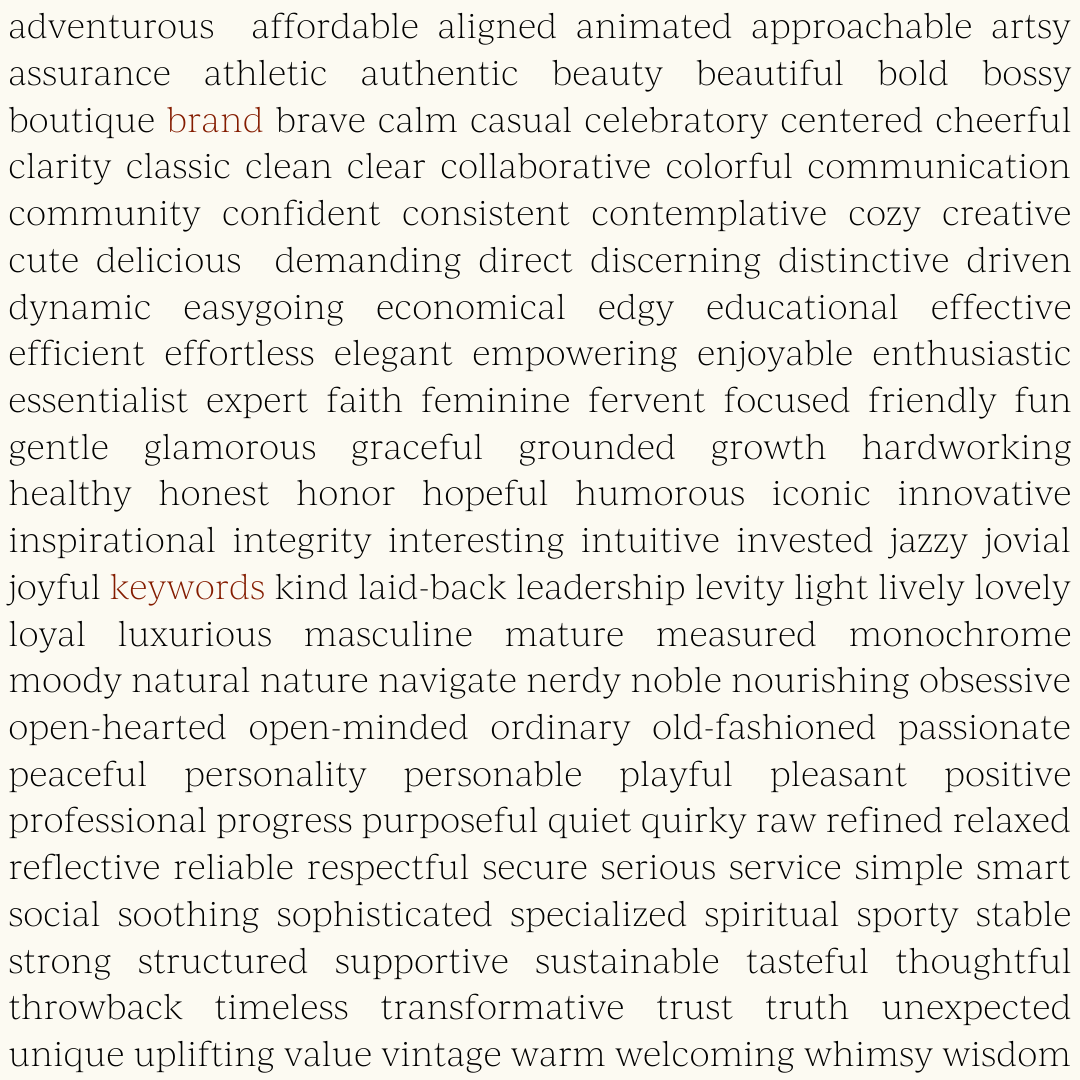
In the visual branding process, I like to collect every adjective I hear my clients say about their audience or what they want their brand to accomplish. I’ll typically end up with a full page of words that can be associated with their brand. I’ll then group the words into categories, finding similarities between words, and then assign one word that best represents all the other words in that category as a “keyword.”
I have a few different lists of keywords for my clients — a list for the Brand, for their People, for their Message, and their Core Values.
-
Brand keywords are the words that reflect what your brand feels like, or the resulting feelings your client has because they have worked with you.
-
People keywords are the words that describe your audience and what they’re searching for. My goal is to have some overlap between your Brand keywords and your People keywords.
-
Message keywords describe the brand tone of voice and how you want to come across in written communications.
-
Core Values keywords are typically already chosen by clients, but in the event that they haven’t thought through their core values, these words provide a starting point for thinking more intentionally. Core Values keywords are often the words they keep coming back to the most in our initial conversation or words that are repeated throughout the brand discovery process (for more on my brand discovery process, read here).
Personally, I like to have multiple lists to work with so that there is a myriad of checkpoints to test my designs against. That way I can make sure every aspect of the visual brand aligns with these keywords and therefore the brand vibe.
However, multiple lists may be too extra as a starting point, in which case I would suggest coming up with 5-10 overall brand keywords that best represent the 30,000-foot view of your brand.
COLOR
Keywords are an important place to start before choosing colors. Without an idea of your brand vibe, how can you choose colors that will resonate with your audience and encourage them to take action?
For example, if I had a brand with keywords like calm, encouraging, simple, and fun, I need to pick colors that embody the feelings of calm, encouragement, simplicity, and fun.
Now, again, here’s where subjectivity comes into play. You might think of “fun” as bright neon orange, whereas someone else might think of “fun” as purple or green.
Your job here is to consider how your audience views fun. What do you know about your intended audience or customers that might inform what they think of as fun, or what colors they gravitate towards when they’re looking for fun?
I’d also encourage you to think about your palette as a whole. Maybe each individual color doesn’t scream fun, but the colors in combination with each other put off a “fun” energy.
This is using color psychology to determine the colors that will create the feelings you’ve chosen from your brand keywords!
There are tons of resources within reach from a quick Google search to help you figure out your brand’s color psychology (a few of my favorites are here, here, and here). Take a peek at your keyword lists and cross-reference with what you find out about each color’s particular psychology, remembering to keep your audience’s viewpoint at the forefront.
As far as how many colors to choose, I will share briefly what I typically do: choose the main color, an accent color from the other side of the color wheel, lighter tints (tints are created by adding white, shades are created by adding grey) of each of those colors, and one or two neutral colors to round out the palette. Sometimes I’ll focus on making sure there is both a warm accent color (reds, oranges, yellows) and a cool accent color (greens, blues, purples), but it truly depends on the brand’s keywords and overall vibe.
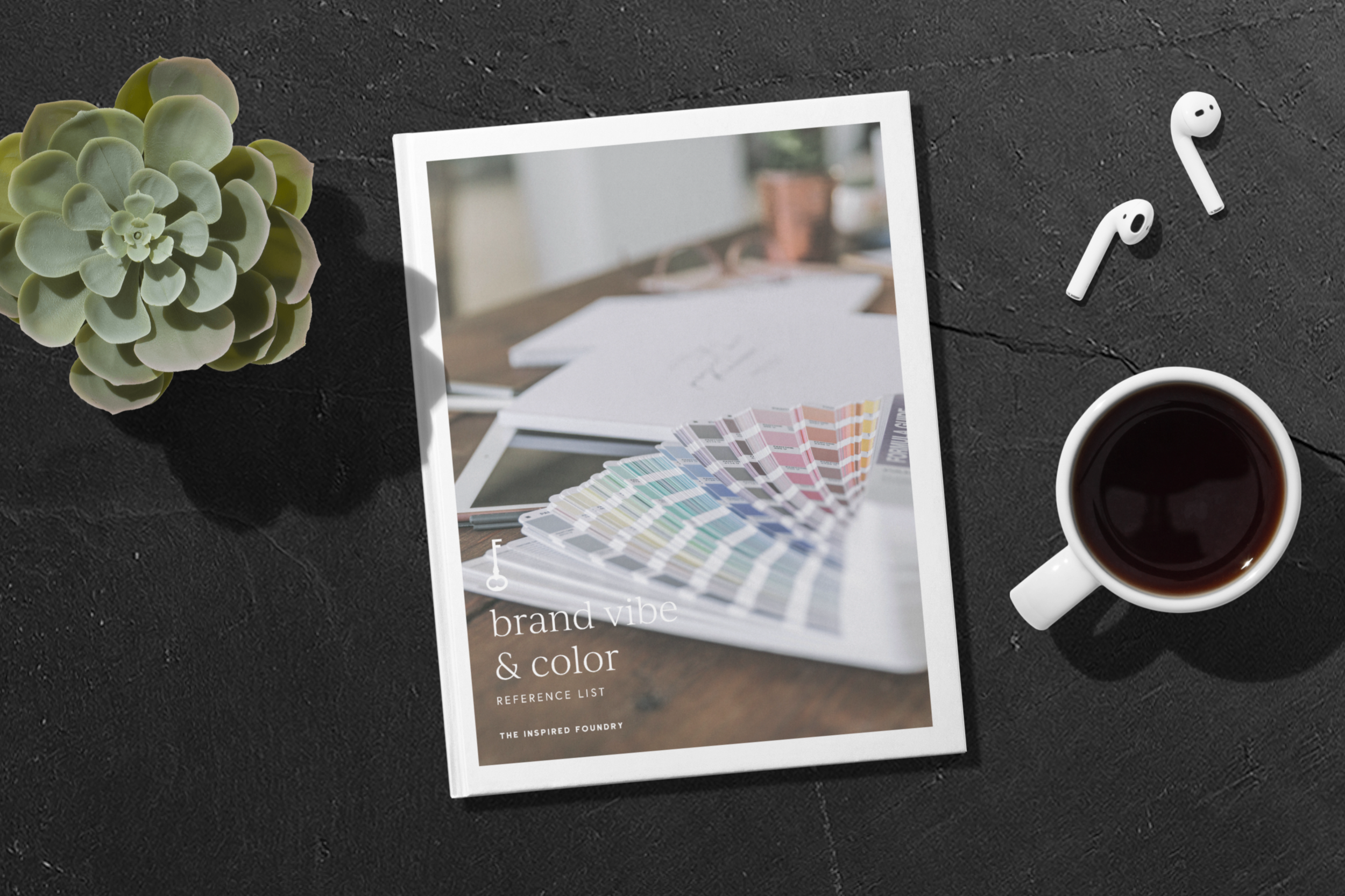
More on choosing colors coming soon, but to help you navigate your brand’s vibe and color psychology right now, I’ve put together a brand vibe and color reference list for you to peruse. I included keywords from past branding clients and the color psychology I’ve used to craft color palettes, along with a few examples of color palettes in practice with their associated keywords to show you how they work together.
You can download it below or find it in the Think Tank Library, a collection of resources from every blog I post (plus some fun extras like seasonal Spotify playlists). 🙂
Got questions about any of this? Shoot me an email! I’d love to connect with you and help you think through your vibe and color conundrums!
PIN ABOUT IT:


")

")


+ COMMENTS