
Matthew Hill Creative is a wedding videography duo based in Marquette, Michigan, and also happens to be family! Matt & Lauren are cousins on my mom’s side — Lauren and I grew up together alongside my sister and our one other cousin, John. We spent Christmases together “sledding” on the stairs in our grandparent’s house, summers at their family cabin up north, and have since attended each other’s weddings and watched our families grow.
They came to me in 2017 for a logo, back before I did much, if any, brand strategy. Our original concept was strong and masculine and worked at the time:
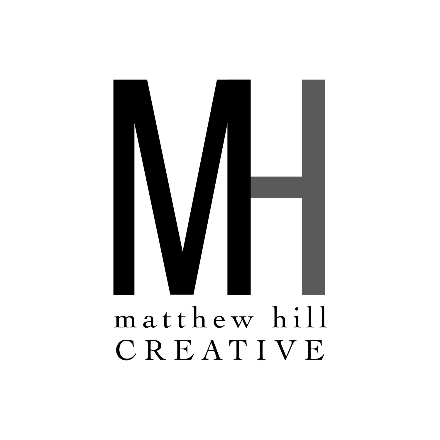
But as their wedding business grew and they became more intentional about the kind of clientele they wanted to work with, it was clear their branding wasn’t doing its job. They needed a fresh look that would help increase their brand recognition among midwestern wedding vendors and help tell the story of how much they love what they do.
Let’s chat with Matt and Lauren about their brand.
Q&A:
What got you into wedding videography?
We’re really nostalgic and love being able to look back at videos of our life and are so excited that we can provide our clients with an heirloom film that they can cherish for years to come.
What made you pursue a new visual brand identity?
We loved our old logo but felt like it didn’t fully represent our personality and love for the romance of a wedding. The black and white were a little cold and did not reflect our personality or warmth in the way that the new brand identity does.
What are your brand strengths?
We truly care about our clients and want to tell their story in the best way that we can. We have been told that we bring a calming atmosphere on a wedding day and that we are always ready to help out in any way we can, whether it is video related or not.
Who is your ideal client?
Our ideal client is someone who is truly passionate about their love story and their partner. They take their relationship both equal parts silly and serious. They are not afraid to show their emotion and to truly be themselves.
What inspired your vision for the new brand identity?
Our new brand identity was inspired by the warmth and one-of-a-kind touch we bring to a wedding film. We wanted a brand identity that portrayed who we truly are and let our clients have a better window into our personalities.
Did our final result match up with your vision?
Very much so! Our new brand identity is much more memorable and it will impart a piece of us on to those who are searching for a wedding filmmaker. It is warm, romantic, and will leave an impact on our potential clients.
THE PROCESS
I sent Matt and Lauren my Brand Discovery Workbook, and we hopped on a call to chat through their answers in more depth. I will admit, I had already considered some potential design concepts in my head prior to our call, so I went in thinking we’d end up with a woodsy, Yooper (the upper peninsula of Michigan is where they call home, for all you non-midwesterners), earthy vibe.
But as we spoke, I learned more about their goals for MHC, their dreams of both working full-time within the business, of being the premiere choice for wedding films across the midwest, not just in Michigan. They longed to work with clients who were intentional about choosing their wedding vendors; they wanted to be seen as a luxurious and high-end brand for their craft.
Taking all of those hopes and dreams into account, I went to work creating a brand that would help them rise to the level they want to be seen at in the industry while still infusing their visuals with the personality, warmth, humor, and loving attention to detail I know to be true about them both.
INSPIRATION
The kind of couples MHC want to work with are couples that take great pride in who is involved in their wedding day. They want to know they’re working with people who believe in marriage as much as they do. They want to put their trust in vendors who will take great care of them as they make this commitment, and visual branding is the first interaction those clients will have with MHC.
One idea that I kept coming back to in the early stages of concept development was creating an element that spoke to their own love story so that when potential clients read about Matt and Lauren and their work, they immediately see how invested they are in their own marriage and how intertwined their love story is with their work.
I thought back to Matt and Lauren’s wedding day in 2016. It was a warm summer day in Michigan — their ceremony was in a church, but their reception was held outdoors at a Girl Scout camp nearby. And it wasn’t campy at all! It was gorgeous — we were surrounded by lush forest and danced the night away in the pavilion overlooking a lake.
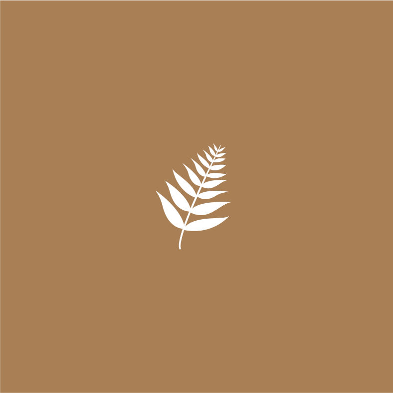
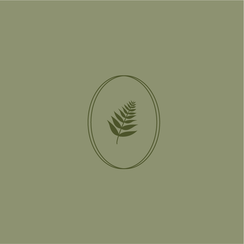
A common thread throughout their wedding was a fern, a native plant to the area and an icon that made its way into their invitations, decor, table settings, and flower arrangements.
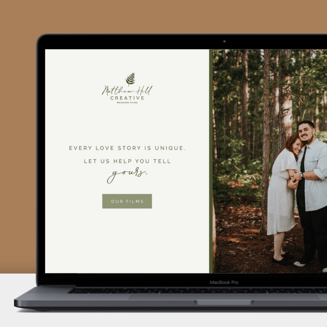
The fern then became the base for their new visual brand, a nod to their own love story and a small detail that can provide connection and reassurance to potential clients that Matt and Lauren care deeply about the details and capturing the ordinarily extraordinary moments of a wedding day.
You’ll notice we did end up with a more earthy vibe with the greens of the color palette, but kept it classic and elegant with an off-white, charcoal black, and warm neutrals.
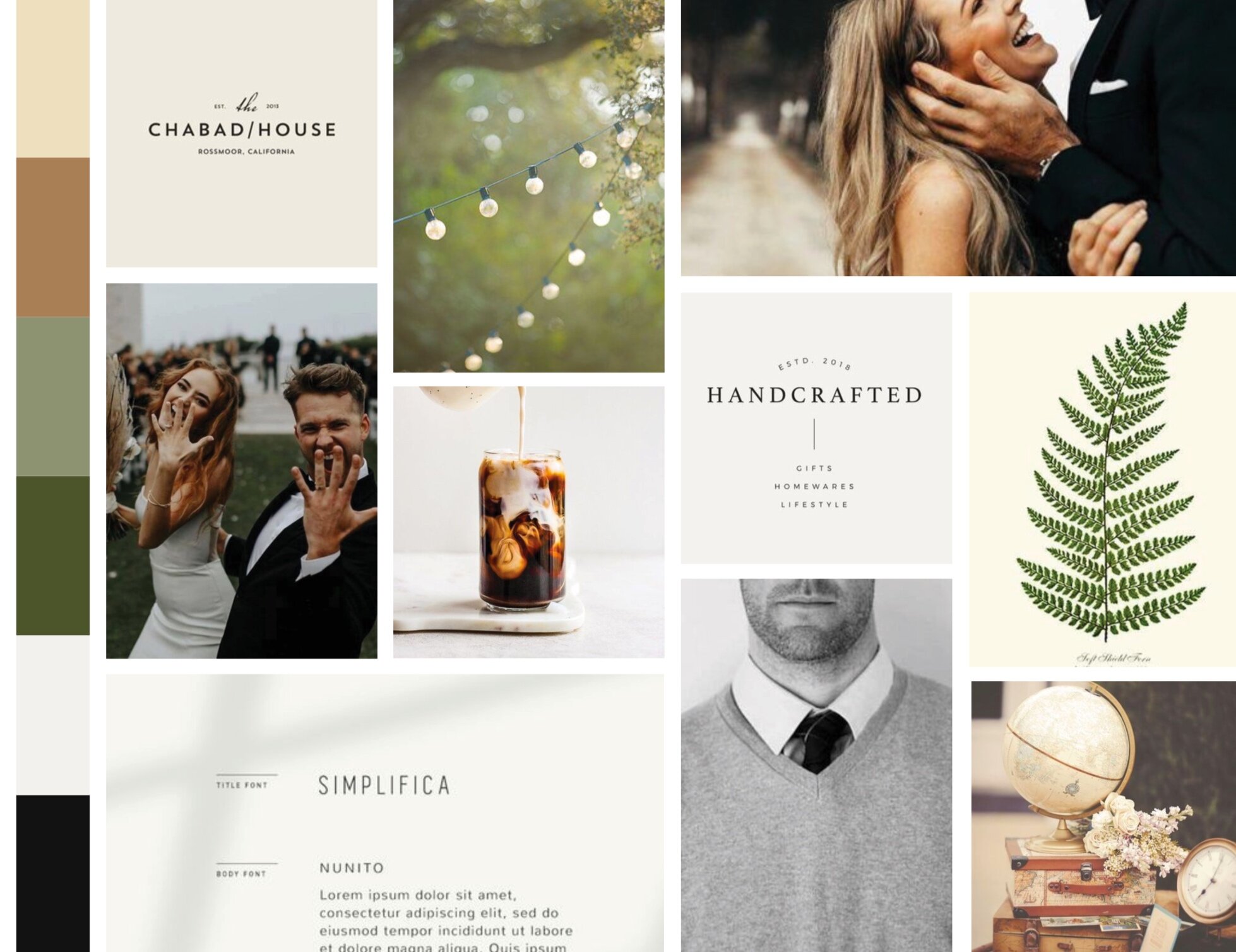
Images sourced from Pinterest, for internal use only
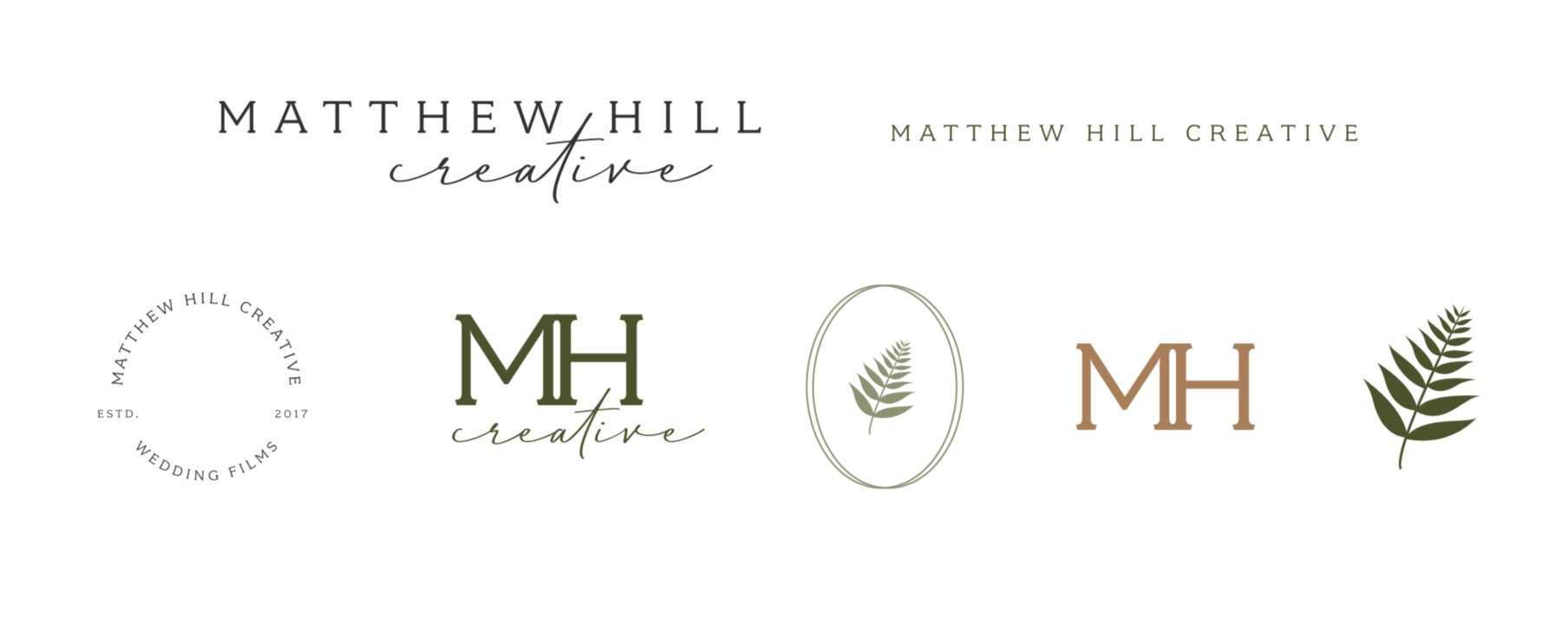
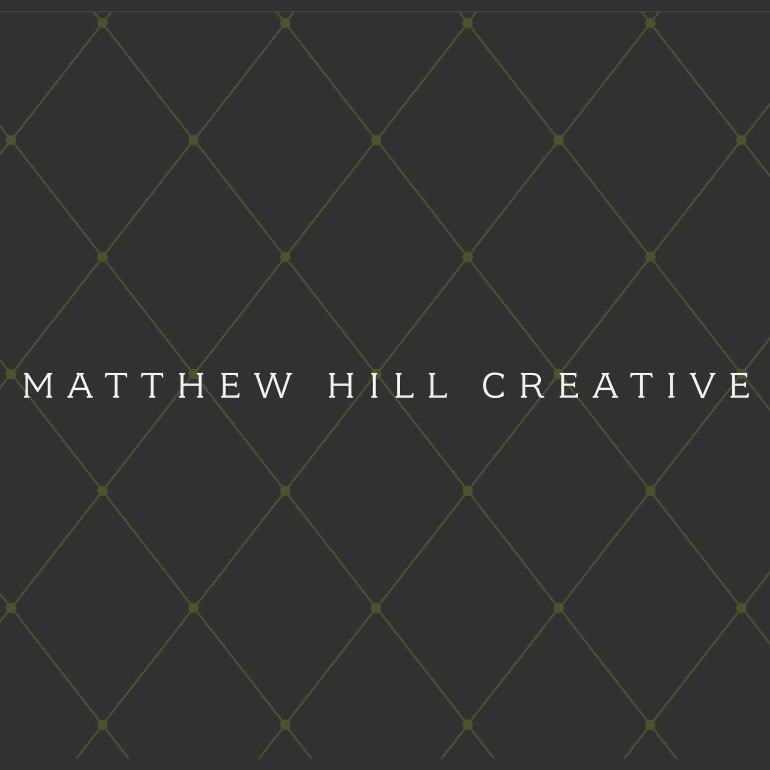
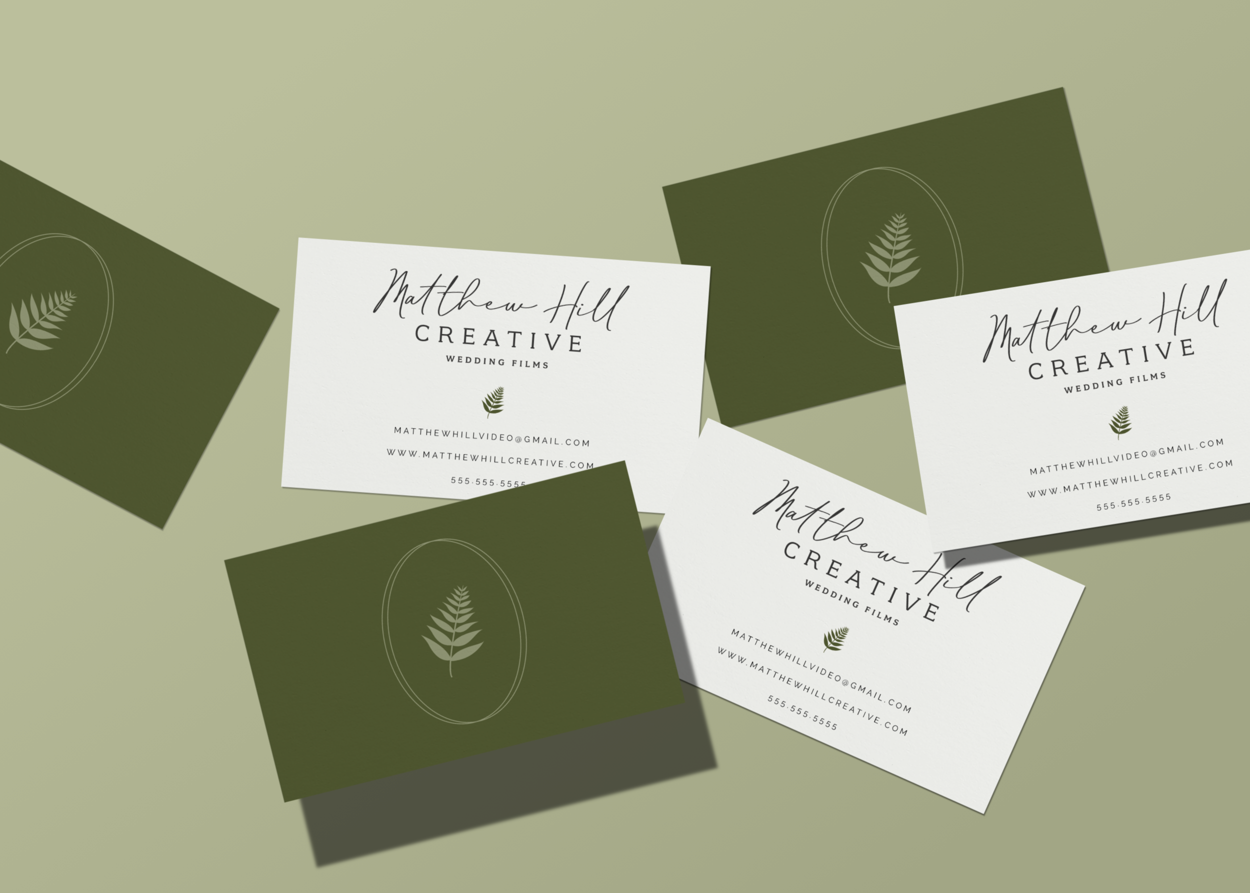
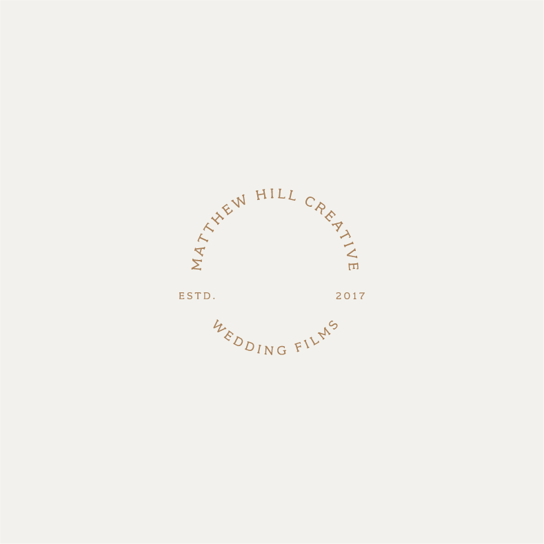
LOGOS
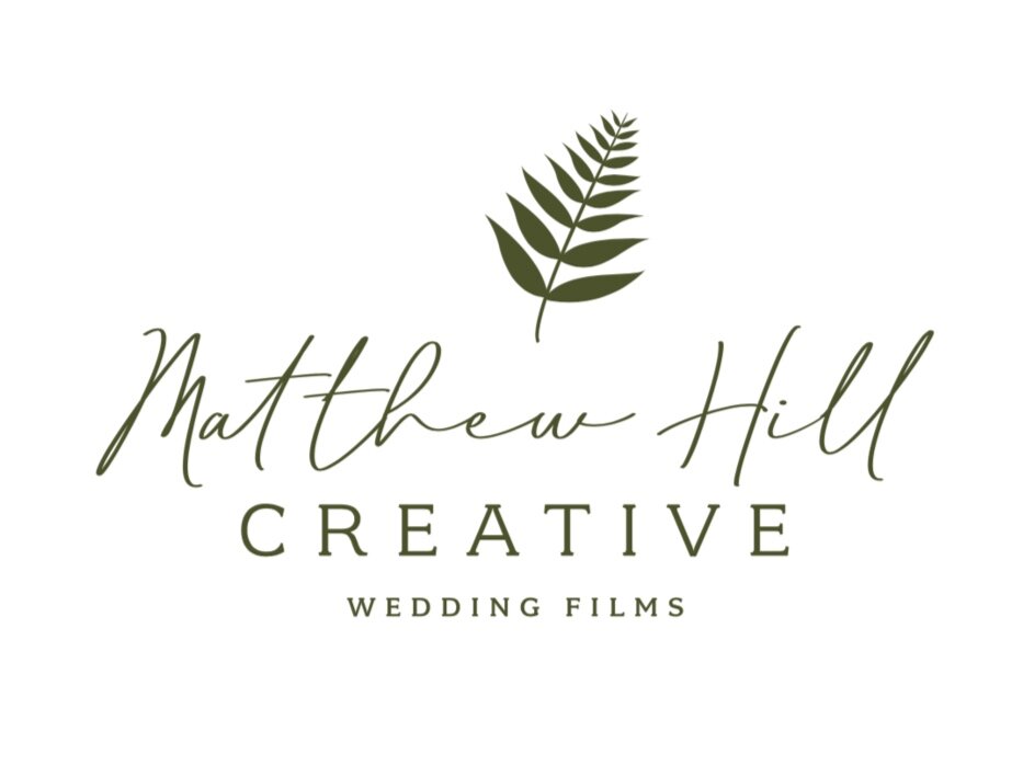
In order to up-level their branding to better fit the wedding industry, we opted for a script font paired with a subtly strong slab serif font for their main logo.
Many wedding vendors end up on the trendy side of things in their branding — and for good reason. The wedding industry is about nothing if not staying on top of current trends.
However, the MHC brand represents the creation of timeless heirlooms that couples can treasure forever, the antithesis of trendy. We wanted their brand visuals to evoke a sense of currency for the times but also reflect the timelessness of nostalgia.
The script font is looks very hand-written and signature-esque, but avoids that sometimes cliché calligraphy look and brings warmth and welcoming to the main logo.
Because today’s brands need a responsive set of logos, meaning the logos can be applied to any size, screen, or situation without losing the impact, we opted for several variations of the main logo to allow for those various situations and spaces.
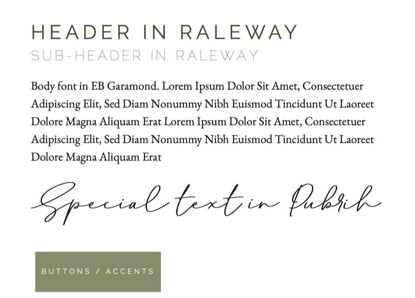
FONTS
Brand fonts are typically different than the fonts chosen for logos. You want your logo to stand out, and therefore any additional typography added into the mix should support the logo, not take away from it.
For this reason, we went with simple and timeless font selections for their brand fonts, ensuring that each font was accessible across the variety of platforms they use for marketing, social media, etc.
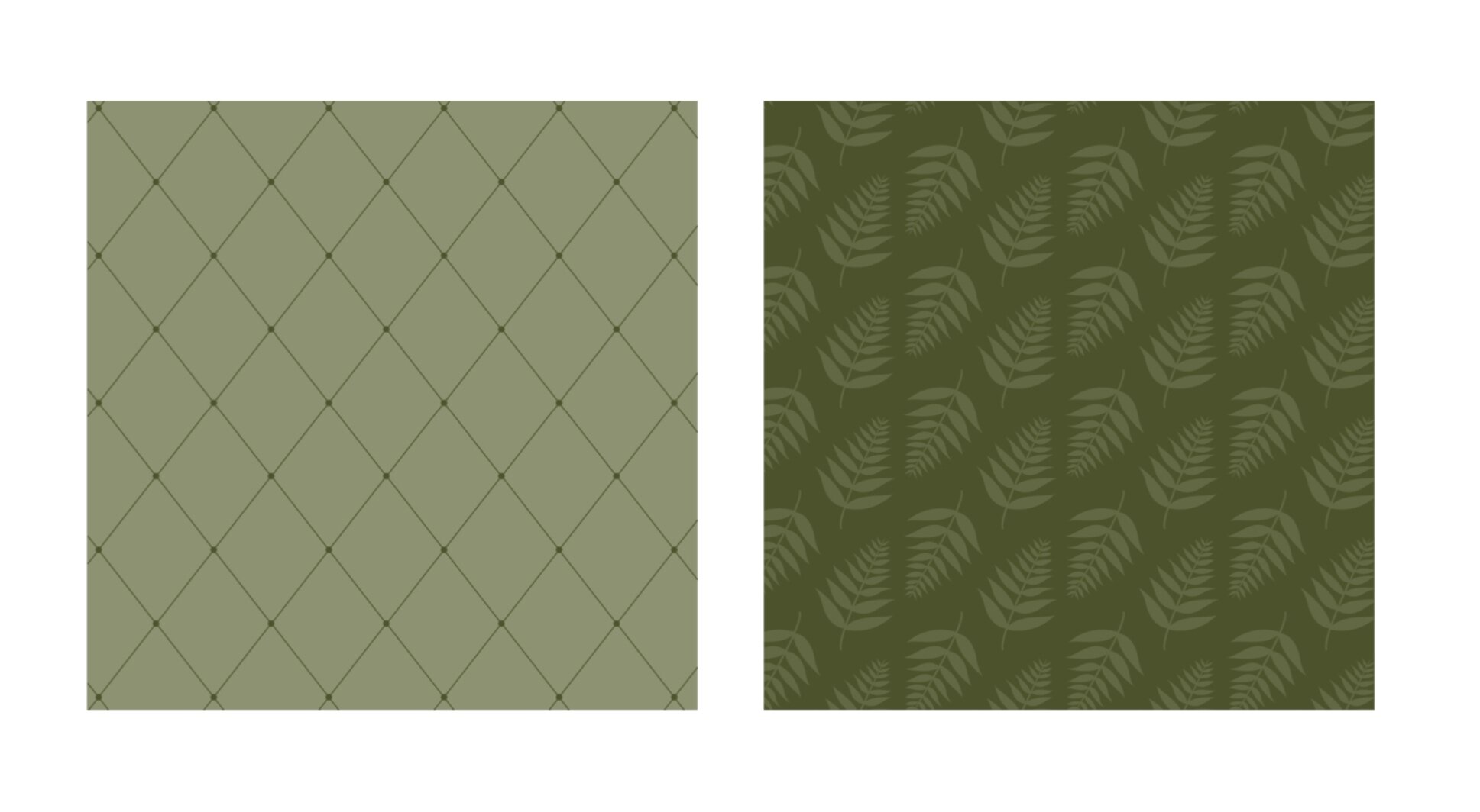
PATTERNS
I love the patterns for MHC. One pattern features the fern icon, and the other is argyle-inspired — all the heart eyes! These patterns are perfect for backgrounds, marketing materials, website footers, etc. Anywhere that needs a touch of the brand without a logo.
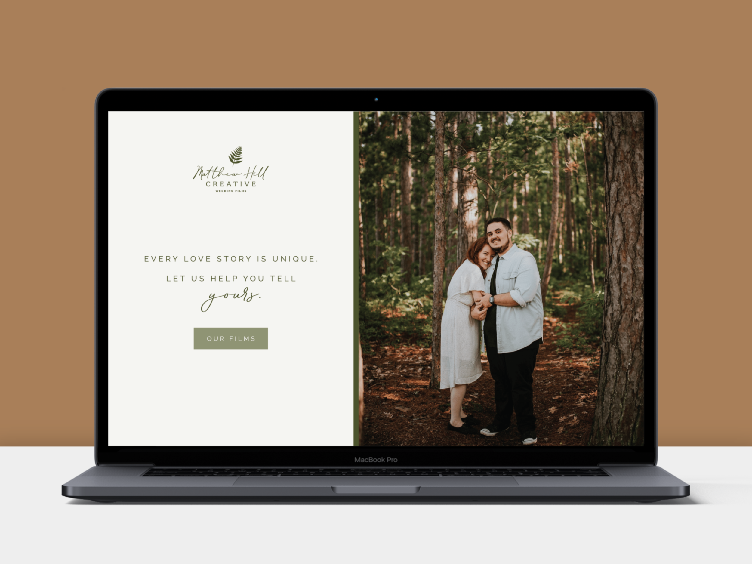
APPLICATION
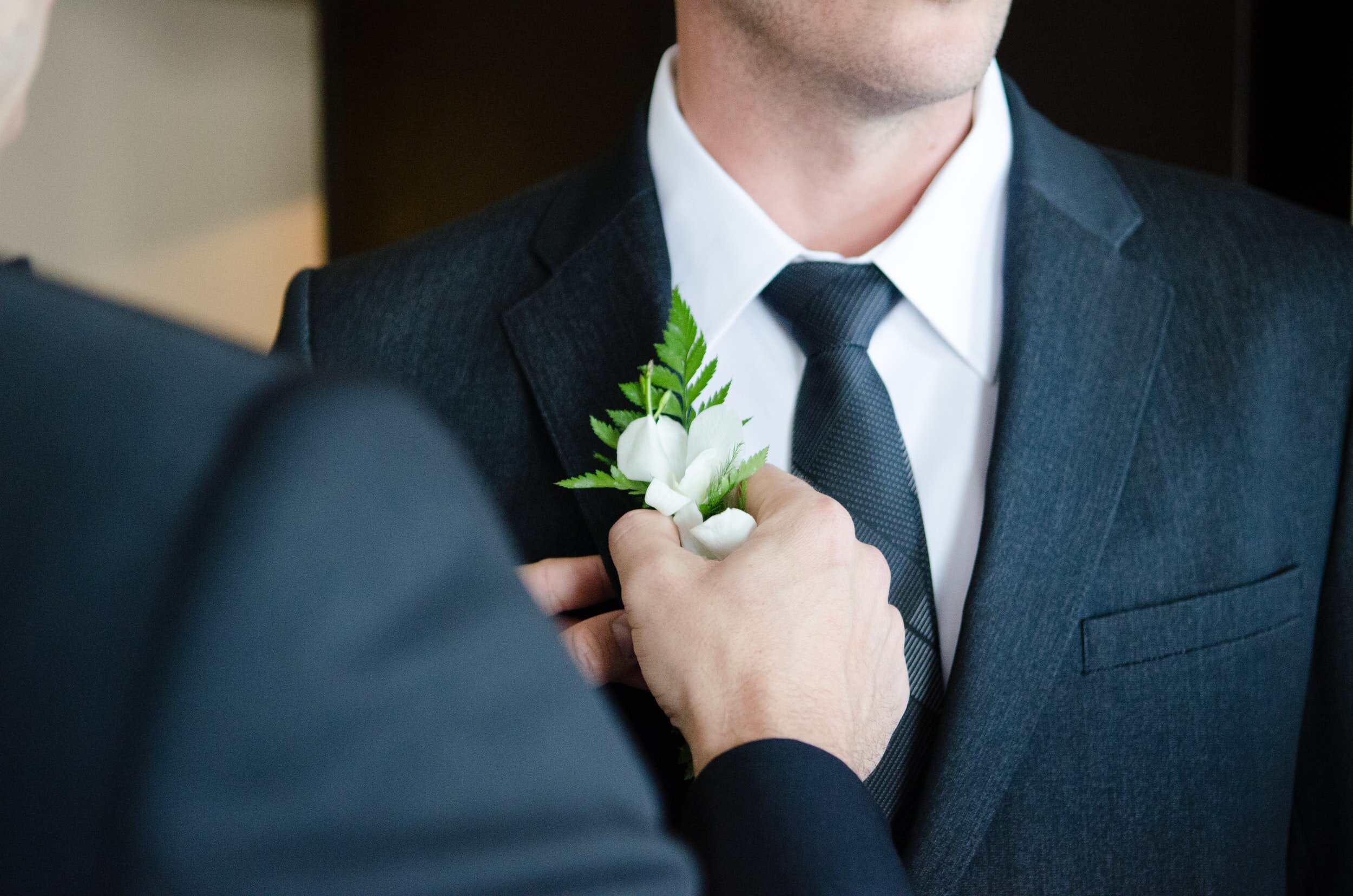
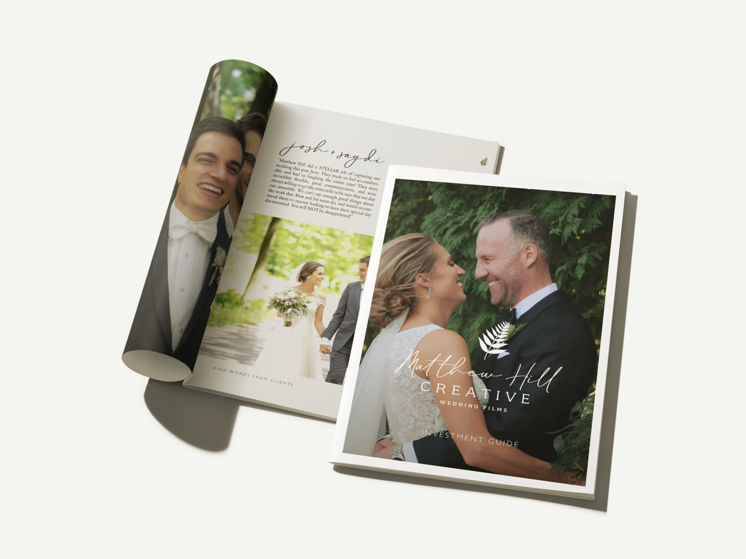
Below are a few examples of the brand applied to real-world scenarios mixed in with brand assets and stock photography.

BRAND FACTS
Logo fonts: Pubrih, Fairplex Wide
Brand Typography: Raleway, EB Garamond
Sent home with: logo suite, patterns, font system, color palette, mood board, custom icon, brand guidelines, social media shareable, social templates for IG, business card design
TAKEAWAYS
Matthew Hill Creative is a great example of ensuring that brand visuals speak to the impact you hope to have on your clients. As you look at your own brand, here are some questions to think about to make sure you’re getting the most out of your visuals:
What elements of your visual brand help tell the story of who you are?
Do you have visual elements that represent what your clients can expect when they work with you?
Do your brand fonts support your main logo or take away from it?
To see more of Matthew Hill Creative’s brand in action, and to view their wedding films (they filmed our wedding after party if you want to see their work + a bit of Karla Colahan/Inspired Foundry history), navigate to their corner of the internet via the buttons below.
PIN ABOUT IT:


")

")


+ COMMENTS