Welcome to the first Tiny Brand Case Study!
What is a Tiny Brand, you may ask?
It’s a collection of fonts, colors, and design elements curated by me specifically for your business or personal brand. It’s like the halfway point between DIYing your brand or buying branded templates on Creative Market and working with a designer on a totally custom package.
As a past Tiny Brand client said, “It’s like a capsule wardrobe for your brand!”
While there are no custom designs involved, you still end up with a polished and professional style for your brand, confidence in sharing your work in your digital spaces, and a solid starting place to build your brand recognition, all within Canva so it’s easy for you to get started implementing your branding right away.
On to today’s Tiny Brand – Macaulley Whitlock!
Mac is a dear friend from way back in college. She currently lives and works in Mexico, but whenever her wandering soul comes back stateside, it’s like no time has passed.
Macaulley is a phenomenal orchestra teacher, director, traveler, and potential “fitfluencer,” or at least I like to think of her as one! On her most recent trip back to the States, we chatted about Tiny Brands and I figured she could use a Tiny Brand if and when she ever decides to break out of her educational career or start a side hustle.
While Macaulley’s Tiny Brand is more along the lines of a practice brand, everything inside holds true for her (except for the title “Joy Consultant,” but even though it’s not real, it should be a real thing). I asked her many of the questions I ask my clients, taking into account what I know about her from our decade-long friendship like her love for cats, travel, and aesthetically pleasing workout outfits.
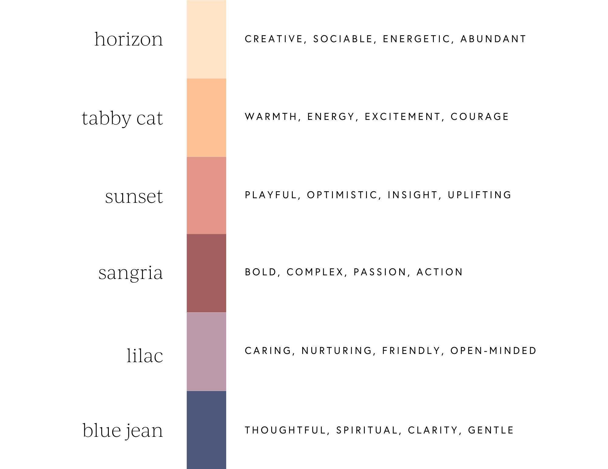
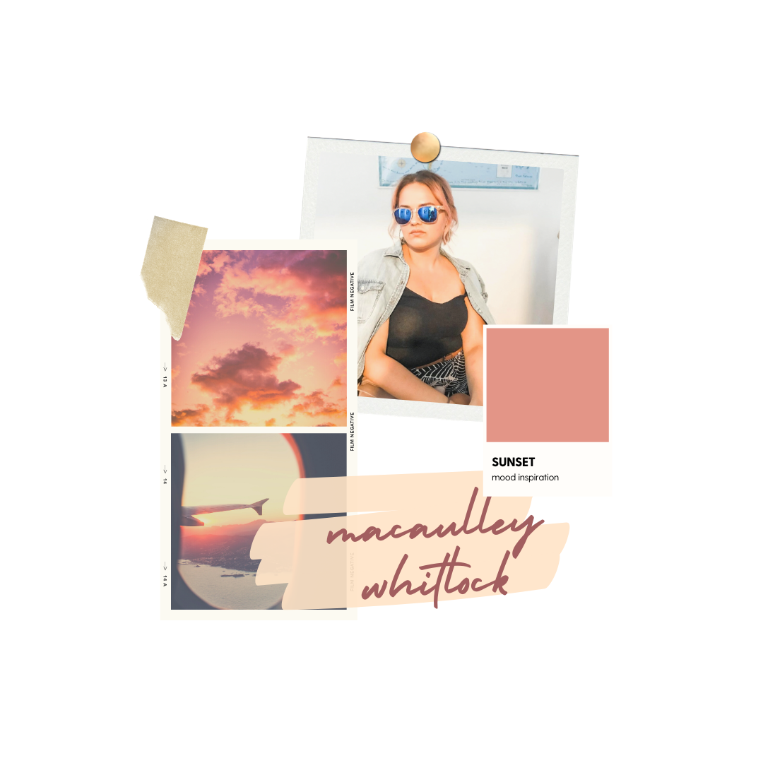
Here’s what we came up with for her Tiny Brand, starting with her brand vibe: keywords, mood board, and color palette.
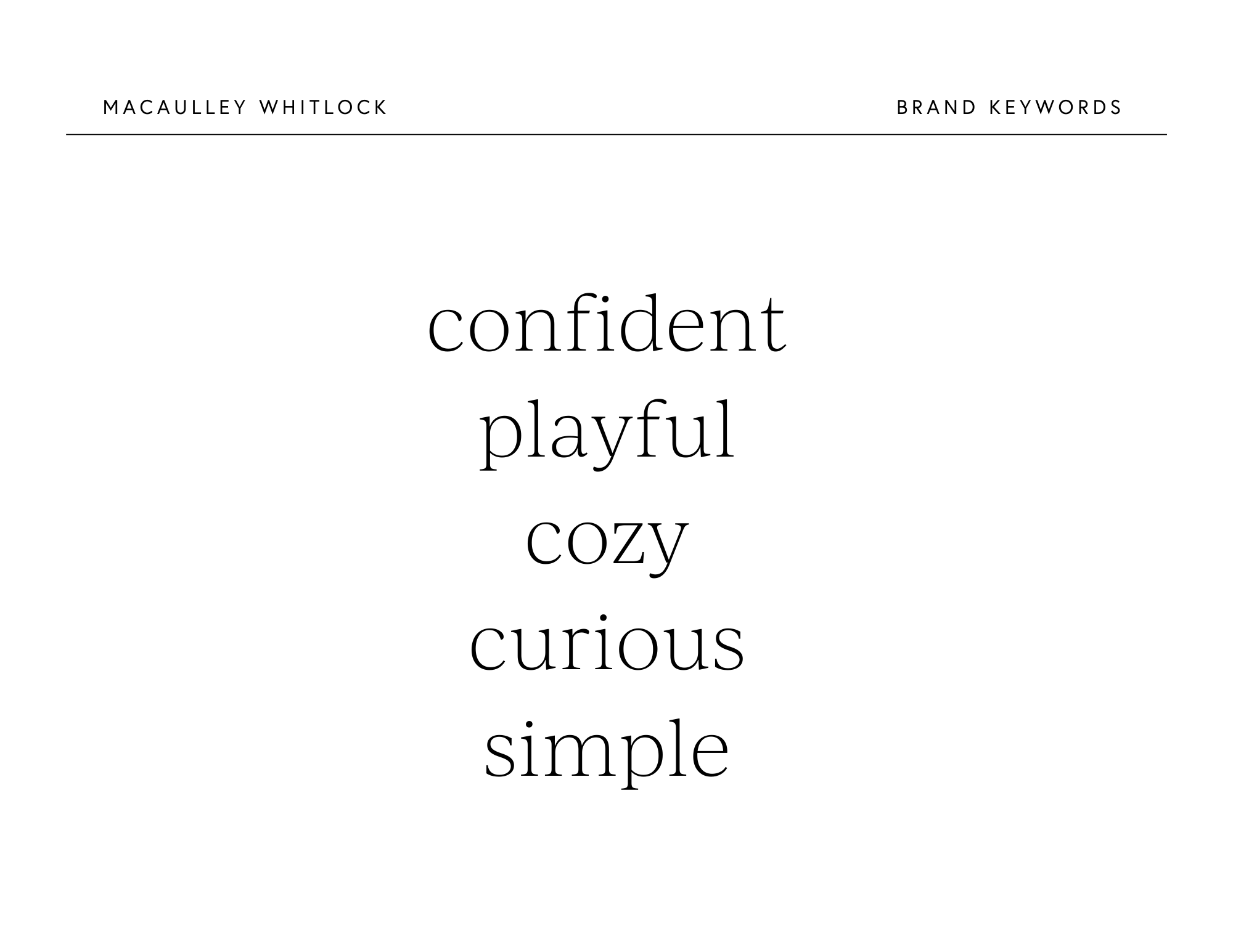
I love the warm energy, cozy playfulness, and easygoing wanderlust vibes present in this mood board. It’s perfect for Mac.

I always include a little color psychology to make clear why these particular colors will work well. Plus, this gives me a chance to name the colors, which might be my favorite part of crafting a Tiny Brand.
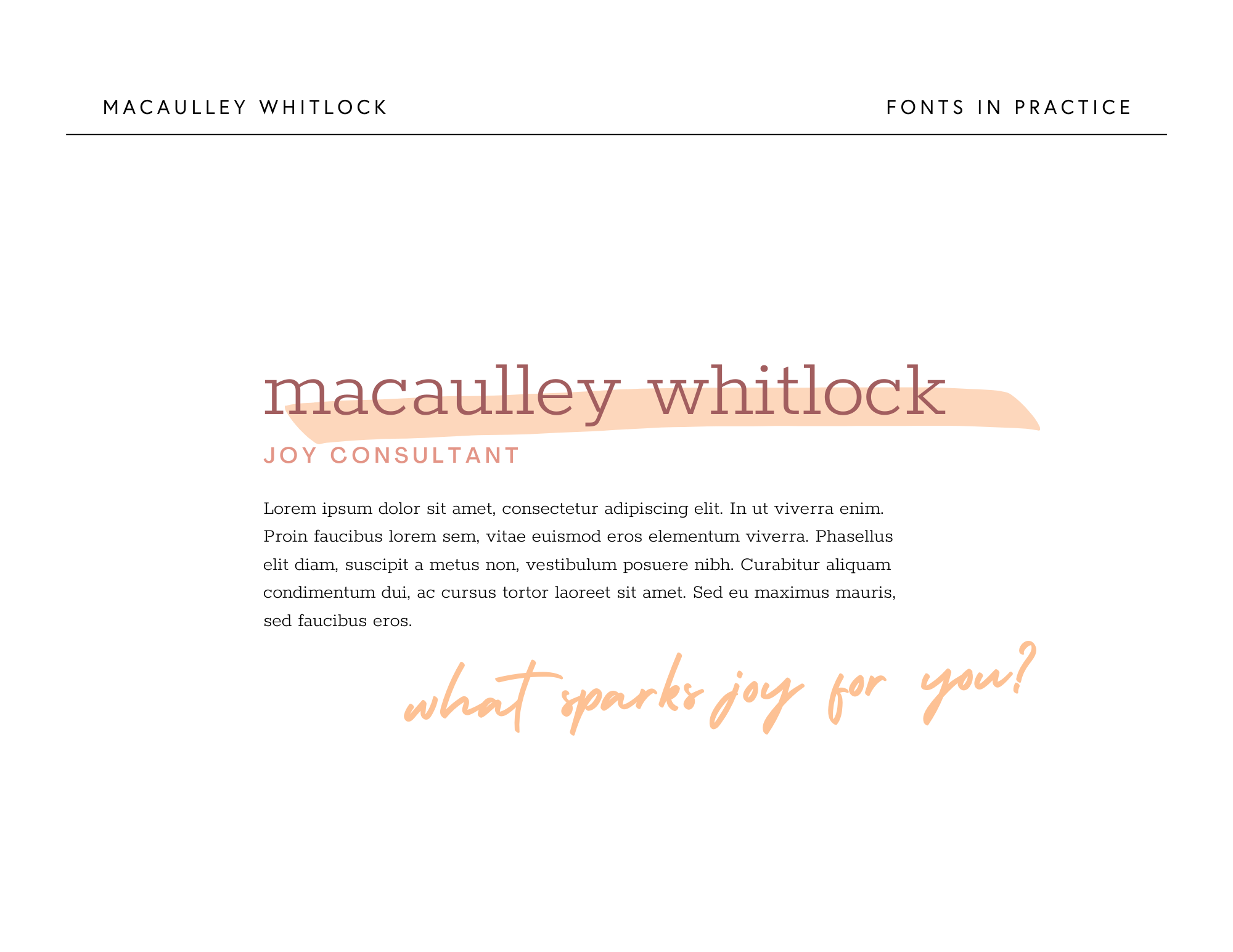
Next, we move into font selections. Macaulley’s personality requires fun and upbeat fonts that don’t take themselves too seriously. Slab-serif fonts (like her heading font below) are perfect for this vibe. Round it out with a casual sans serif font (sub-heading font) and a marker-inspired script, and we’ve got the perfect concoction for Macaulley’s brand.
With colors and fonts secured, we can create a few brand examples pulling those elements together and introducing the specific design elements I chose from what’s available inside of Canva. In this case, I ended up creating a “xoxo” mark from her script font and grabbed a highlighter background texture or two to complement the marker-style script. It’s simple, casual, super friendly, and embodies all the “cool girl” vibes.
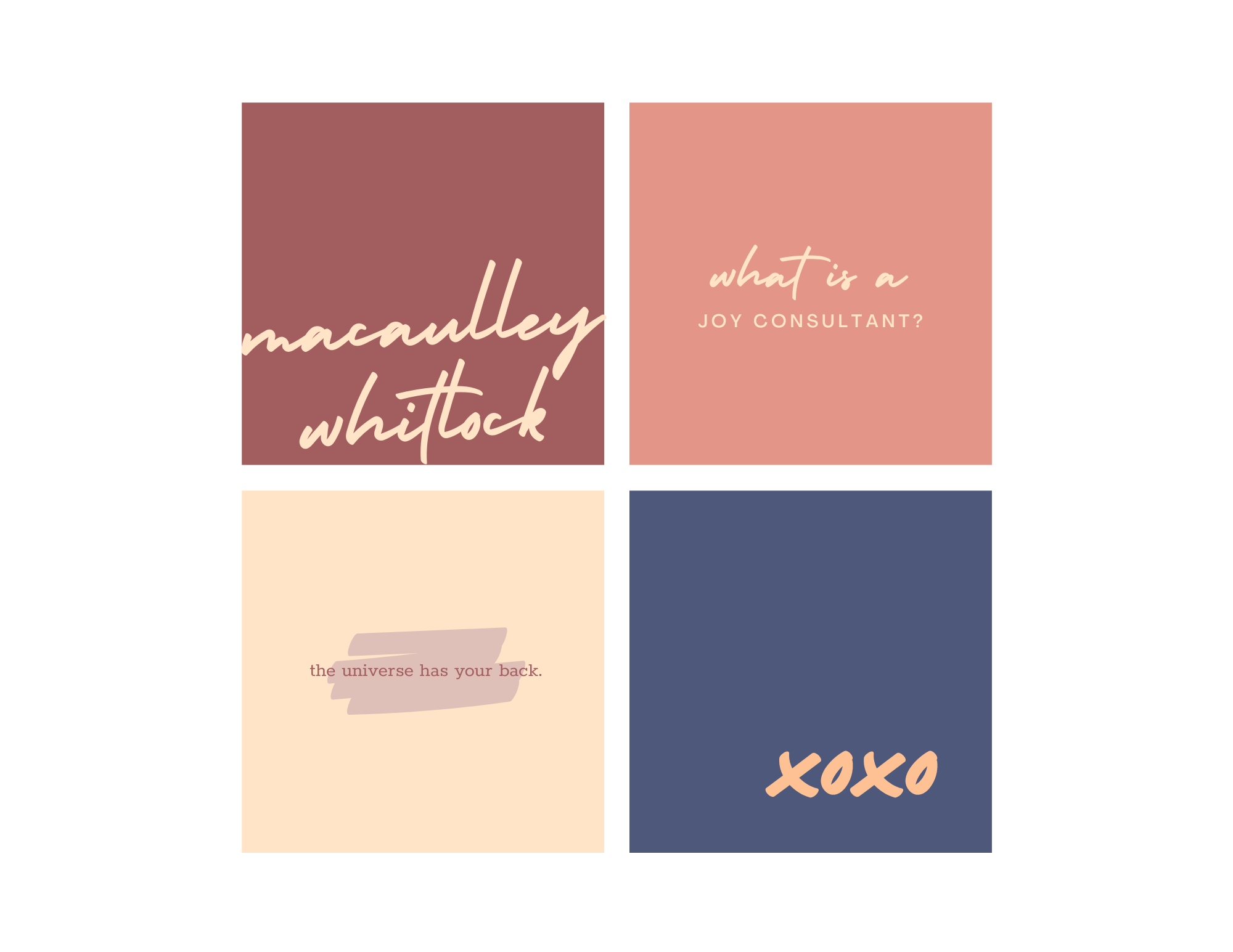
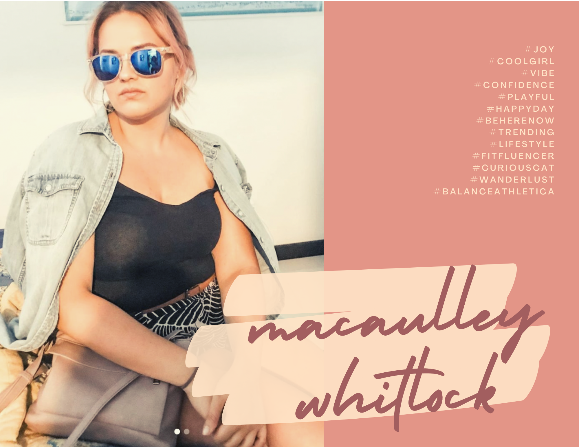
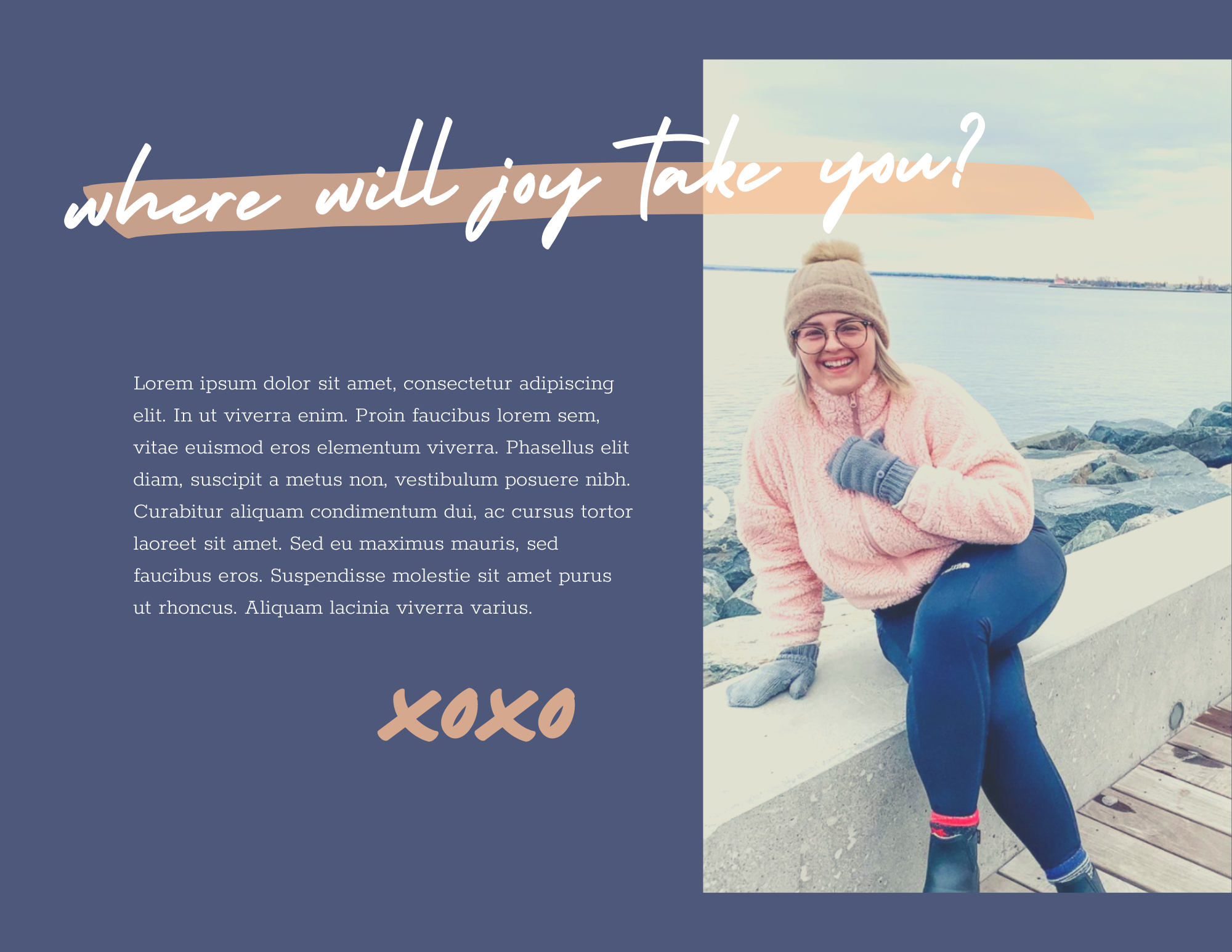
Basically, this Tiny Brand makes me want to be best friends with Macaulley all over again. It speaks to her warm and joyful personality, her “cool girl” energy, and her infectious laugh. I am hopeful that when she’s ready, she’ll use this Tiny Brand and share her joy with the world because everyone needs to be BFFs with this girl.
Love this Tiny Brand and want one for yourself? Reserve your own Tiny Brand right here!

+ COMMENTS