

I met Megan through our work together at hope*writers. She is the Launch Manager, so we’ve worked closely right from my onboarding on social graphics and establishing the new hope*writers brand throughout social media. I quickly learned what a valuable asset Megan is to the HW team — it’s no surprise that her social media expertise has grown the hope*writers accounts to nearly 40k followers over the last two years.
In her own work, she’s growing a business as the go-to social media marketer for simple and streamlined systems. One glance at her Instagram account and you know straight away what kind of marketer she is: authentic and real, entertaining, and unafraid to show up and encourage you to do the same.
In this case study, I’ll walk you through how we put together the Megan Ericson brand from inspiration to the final product and how it’s functioning in the world right now.
But first, let’s chat a little with Megan about her brand.
Q: What got you into social media marketing?
A: All my elementary school teachers wrote on my report cards, “Good student but talks too much in class.” My passion for communication began early and never stopped. Marketing is a fun puzzle that marries the psychology of what we know about a group of people and connecting them with a product or service we know will benefit them through the available avenues of communication. I have a gut instinct for what will connect with certain people and motivate them to act.
Q: Why did you pursue a new visual brand identity?
A: I want to transition from “just” a consultant to a full-fledged business [with] a more professional appearance on my website, email, cost proposals, social media, and all other collateral. I very much DIY-ed my brand a year ago — I bought a branding kit and choose my colors, but I never really had a logo. I liked the colors but they didn’t feel cohesive. I’m looking to build trust and prove I can help by demonstrating my knowledge with my podcast and leading by example.
Q: What are your brand strengths?
A: Calming the overwhelm. Taking what may seem complicated, simplifying, and systematizing. Set-it-and-forget-it systems that save company time and energy, and – most importantly – generate leads. No grow-millions-overnight schemes, but instead setting expectations for sustainable growth over time.
Q: Who is your ideal client?
A: A 30-something woman who values efficiency, stability, attracting customers to her business that actually need the product; is passionate about serving their customers well with smart solutions and integrity; always in pursuit of passion, innovation, and creativity. She does NOT value flashy, maximalism, growth at any cost. Nerds out about her “thing” (whatever that may be), and the line of business/personal maybe be fuzzy because she loves what she does and integrates more parts of her life. She invests a ton of time in her “people,” building strong family and friend relationships. Usually has a just-for-fun creative pursuit/artistic outlet. She’s not afraid to invest in herself.
Q: What inspired your vision for this new brand identity?
A: Timeless is a priority for me. I swoon when I see anything from designer Dorothy Draper — the 1920s logo is perfection. I also LOVE the design of Emily P. Freeman’s last book, The Next Right Thing. Bold, graphic, the color palette of green, black, and white.
Q: Did our final result match up with your vision?
A: 100% – my new brand is perfection.
THE PROCESS
Megan filled out my Brand Discovery Workbook and sent it back to me chock full of great answers and thoughtful words about her business and what she’s looking for in a new visual identity.
From her words, I took notes and jotted down keywords that stuck out to me, and then sketched out my initial ideas so I wouldn’t forget them when it came time to design.
The first part of the branding process is collecting information, gathering inspiration, and creating a brand strategy — a container for all the important aspects of your brand that inform the design concepts.
Here’s an obviously professionally photographed shot of my initial notes and sketches:
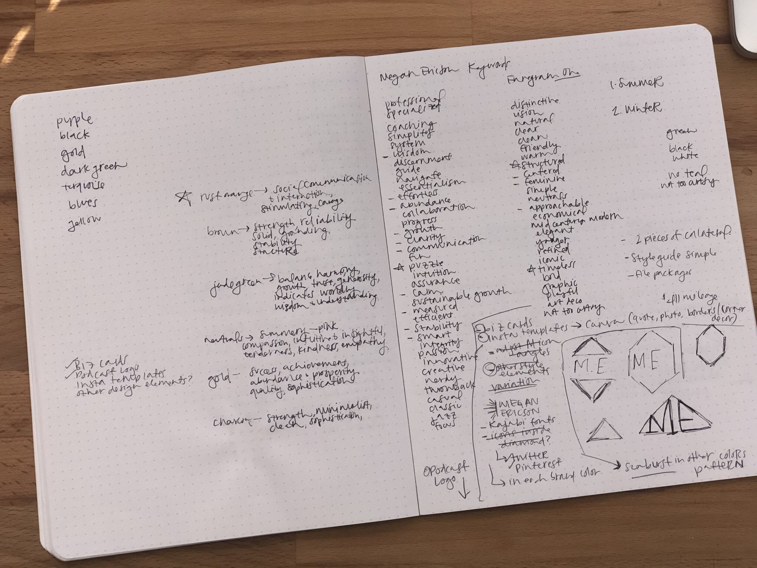
From the start, I knew I wanted to give her a brand mark that almost acted like its own social media icon, something memorable and instantly recognizable as Megan Ericson – Social Media Marketer Extraordinaire, hence the monogram ME sketches in the bottom right corner of my notes.
With a list of keywords, her midcentury-modern-meets-art-deco inspiration, and knowledge of how her competitors were marketing themselves, the next step was creating a mood board and color palette.
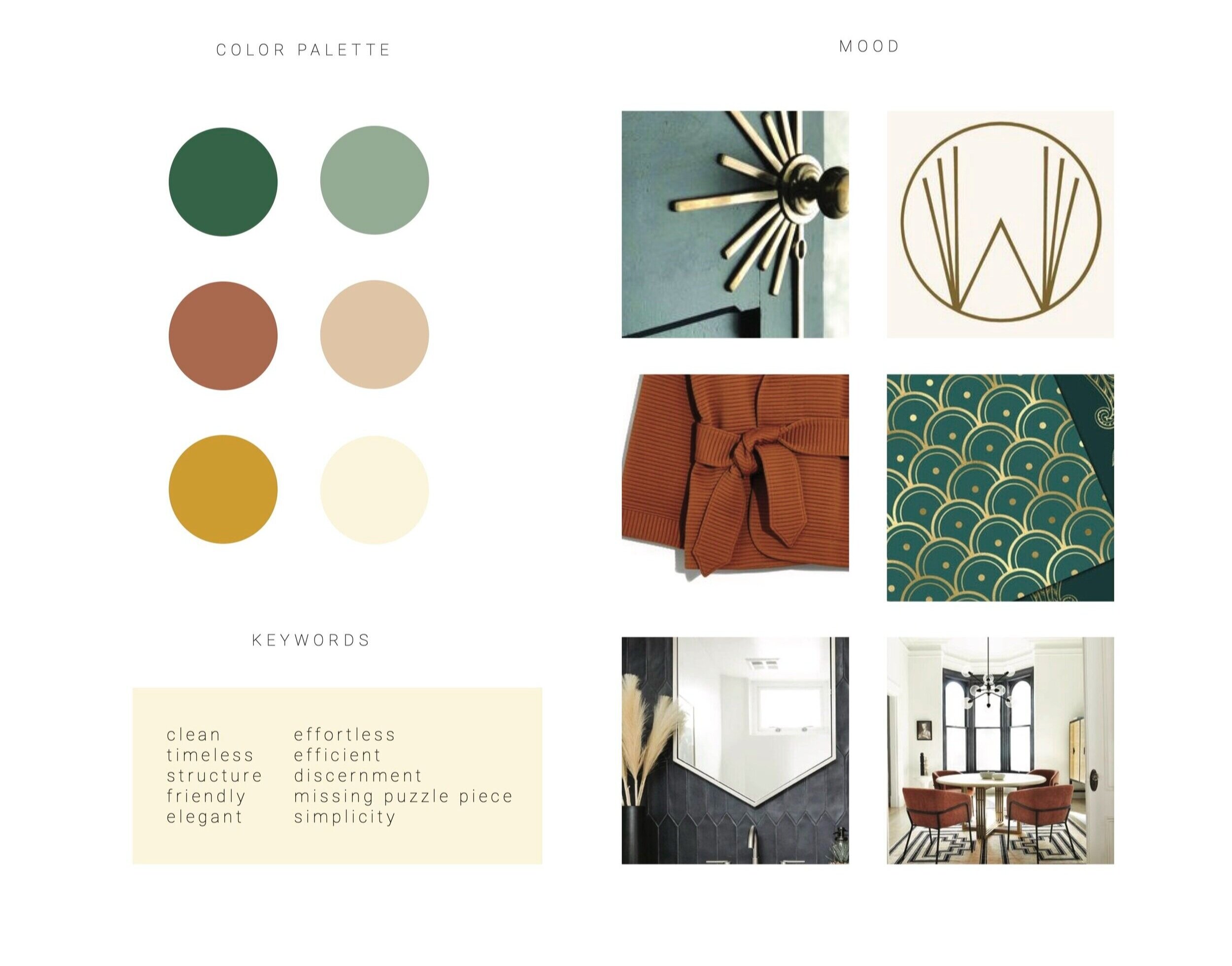
Her competitors — other solopreneur social media marketers — tend to rock color palettes of blue, pink, and neutrals. That in and of itself was a clear indication to take her brand in a different direction. You’ll notice plenty of art deco influences through monoline and geometric shapes, patterns, and mid-century modern interior aesthetics. Megan has a passion for minimalist wardrobe pieces, too, so I threw in that gorgeous Madewell sweater to cap off the vibe and help it feel timeless, effortless, and simple.
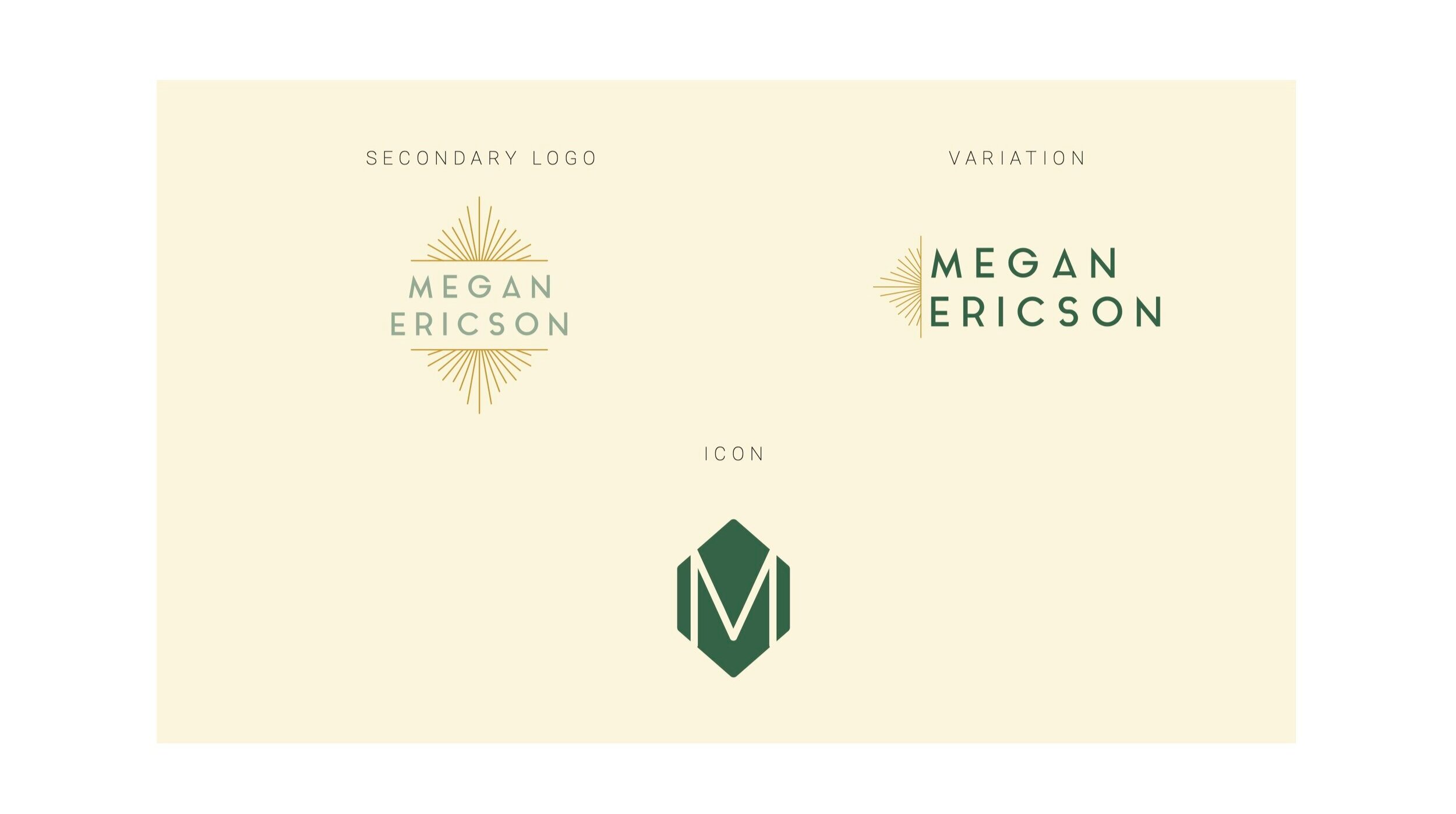
Out of this, design concepts took shape easily. Here’s a breakdown of what we created for her logo suite:
DESIGN CONCEPTS
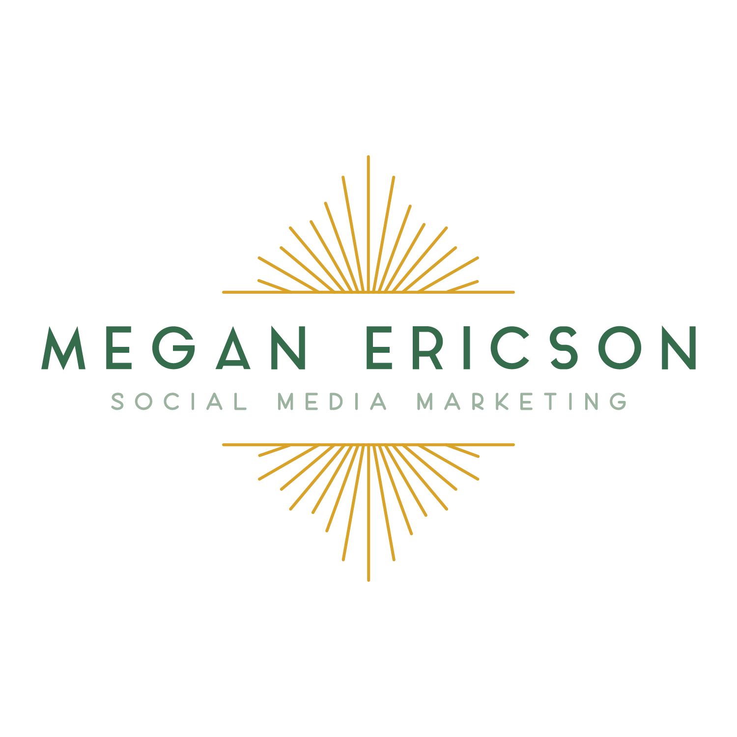
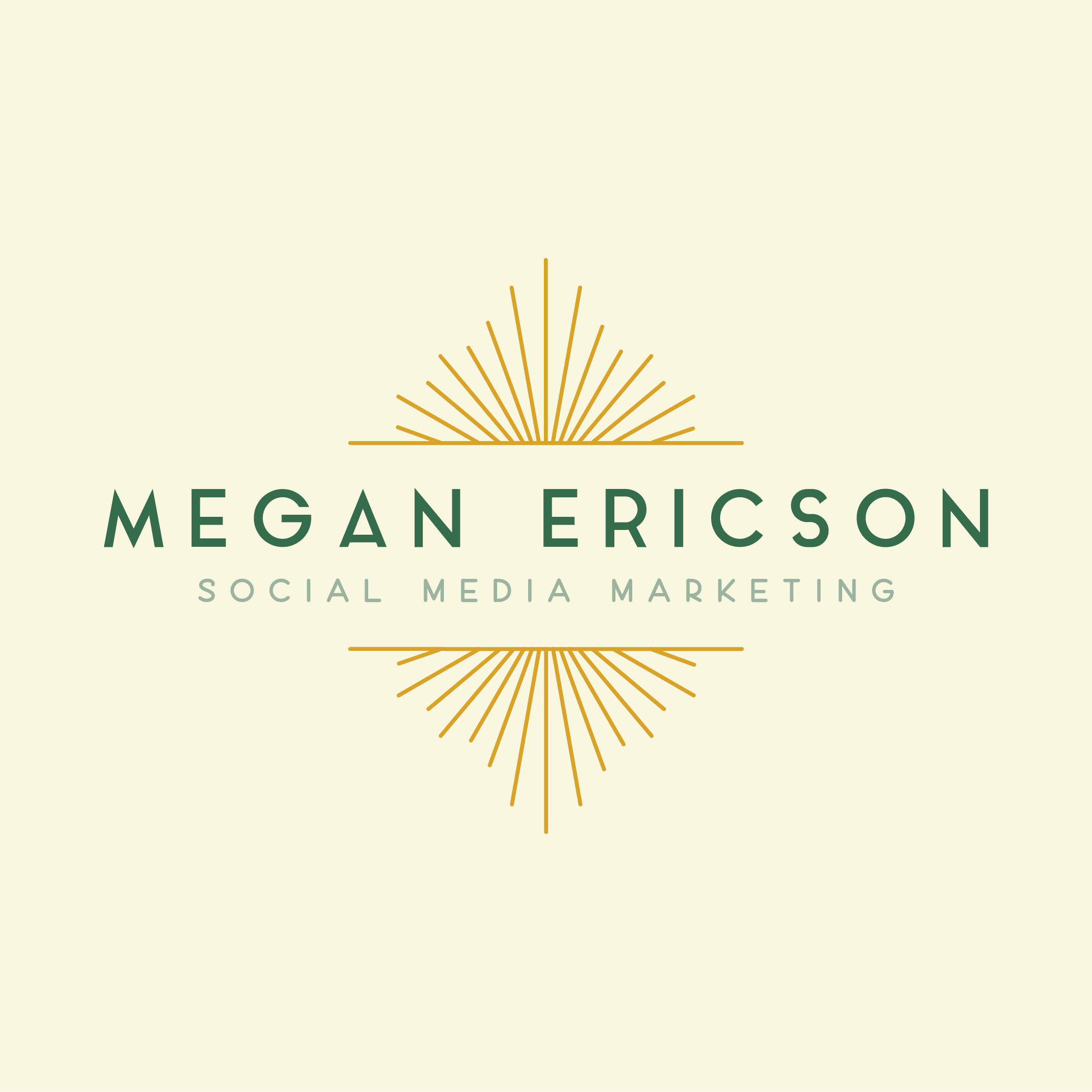
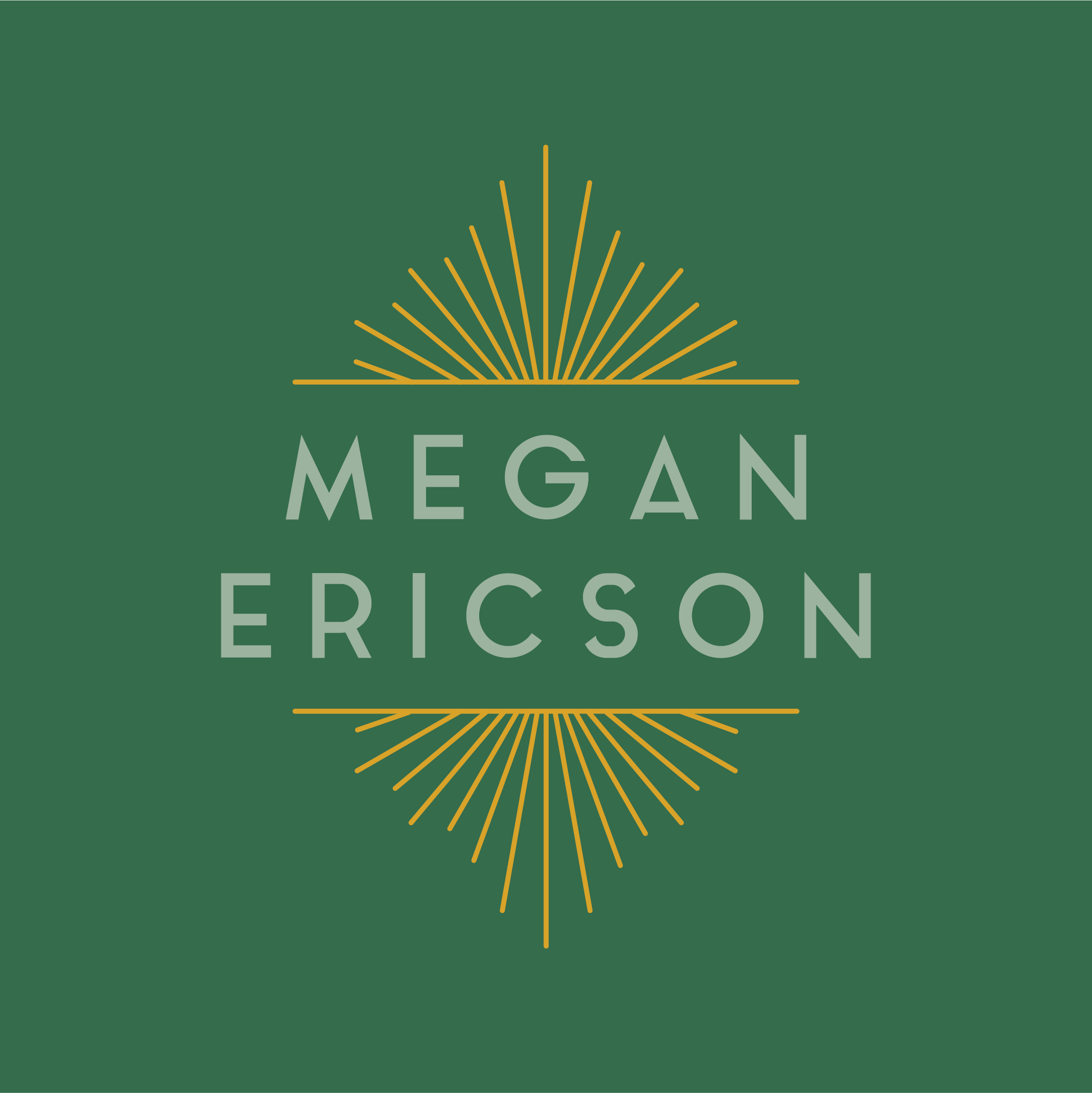
The main logo features a monoline sunburst in a 1920’s-inspired decorative border. It’s a representation of streamlining, clarity, organization, and the many available avenues of marketing with Megan’s name at the center to highlight her talents in helping clients organize their marketing efforts.
The logo variations below provide spatial differences for various applications, both featured without the tagline.
I love the M brand mark — it has that strong and simple quality shared by many social media logos, but with a touch of a “superwoman” vibe, nodding to Megan’s full life with a 15+ year career in marketing, children, husband, and a growing small business.
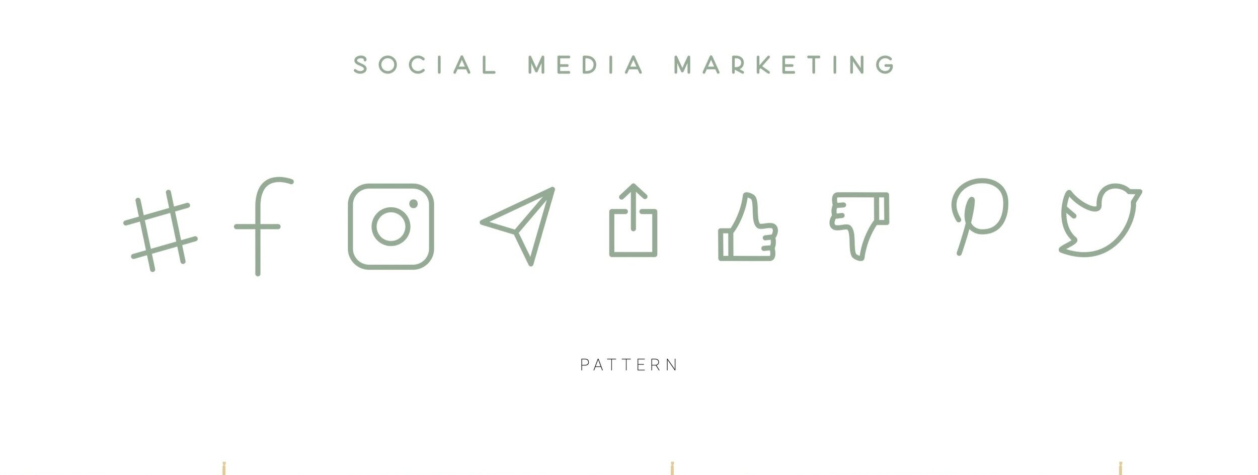
ICONS
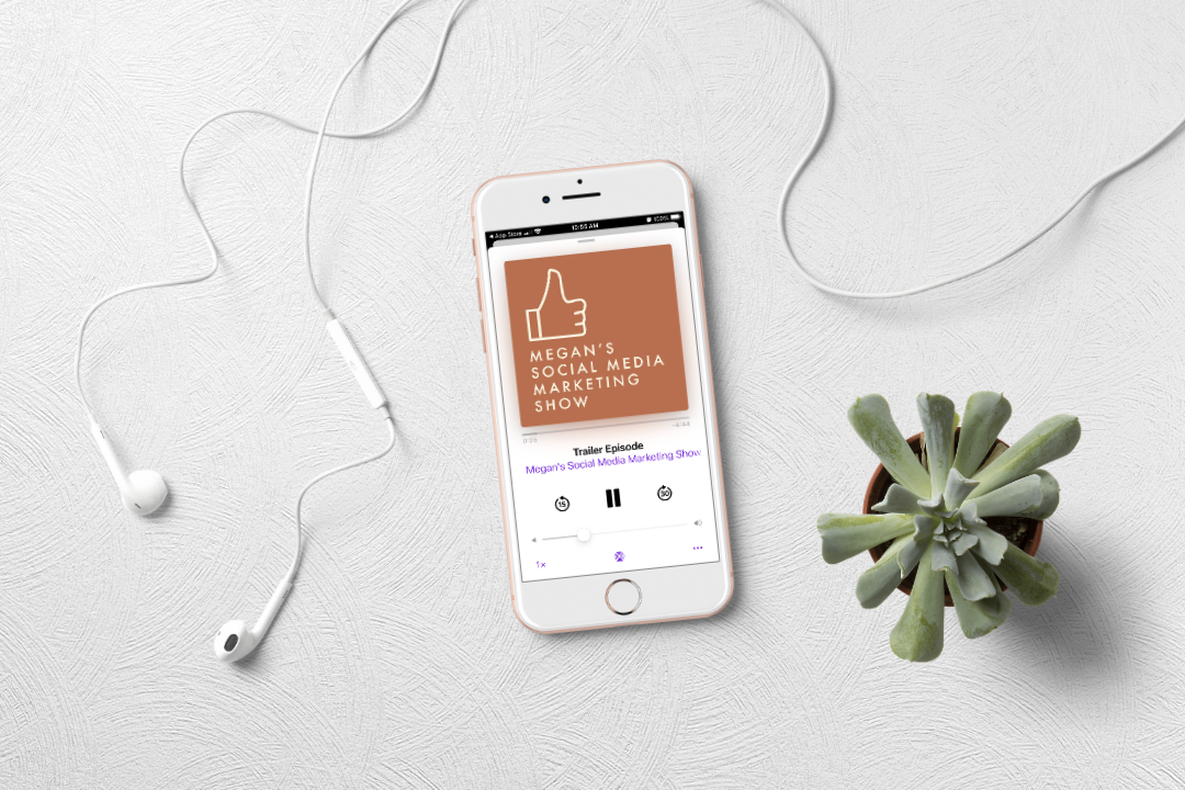
We created her own set of custom social media icons for use in her education on the various trends and intricacies of each social platform. The thumbs up or “like” icon became the primary feature of her podcast logo. We kept them all monoline to match the sunburst and tagline font.
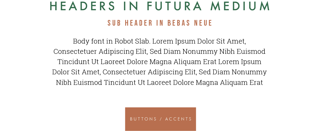
FONTS
We chose a font system that resonated with the art deco vibe but brought in modern touches. Josefin Sans is used as a Futura substitute when not available — it’s always good to have a backup plan for fonts depending on what software you use for marketing materials.
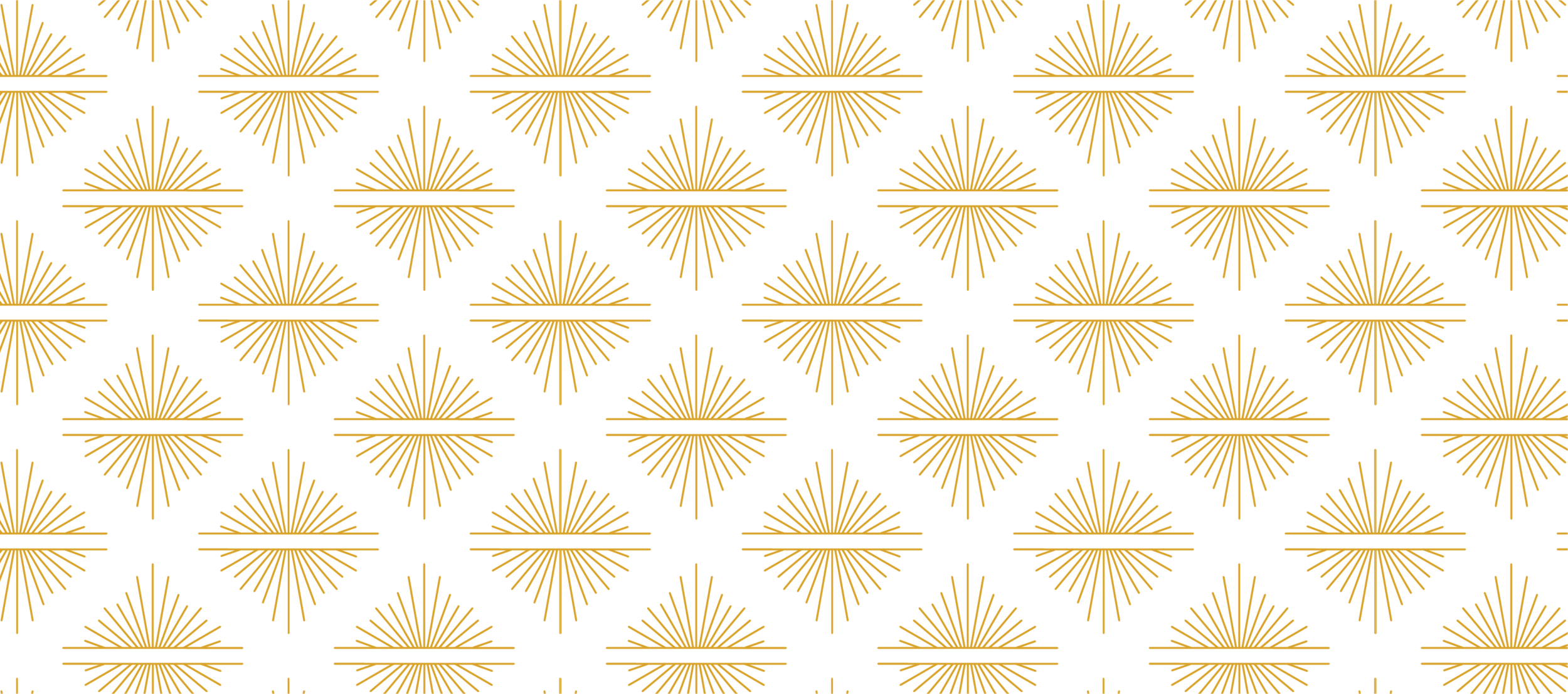
PATTERN
The last piece of her initial suite was a pattern featuring the sunburst for use as a background texture.
We have since updated her brand assets to include additional patterns, new social media graphics, and branded graphics for her podcast promotion. Keeping a brand fresh is one of my favorite aspects of brand design — finding new and interesting ways to use the color palette, font system, and general aesthetic is how brands, especially creative ones, enjoy longevity and recognition as an evolving and current brand.
APPLICATION
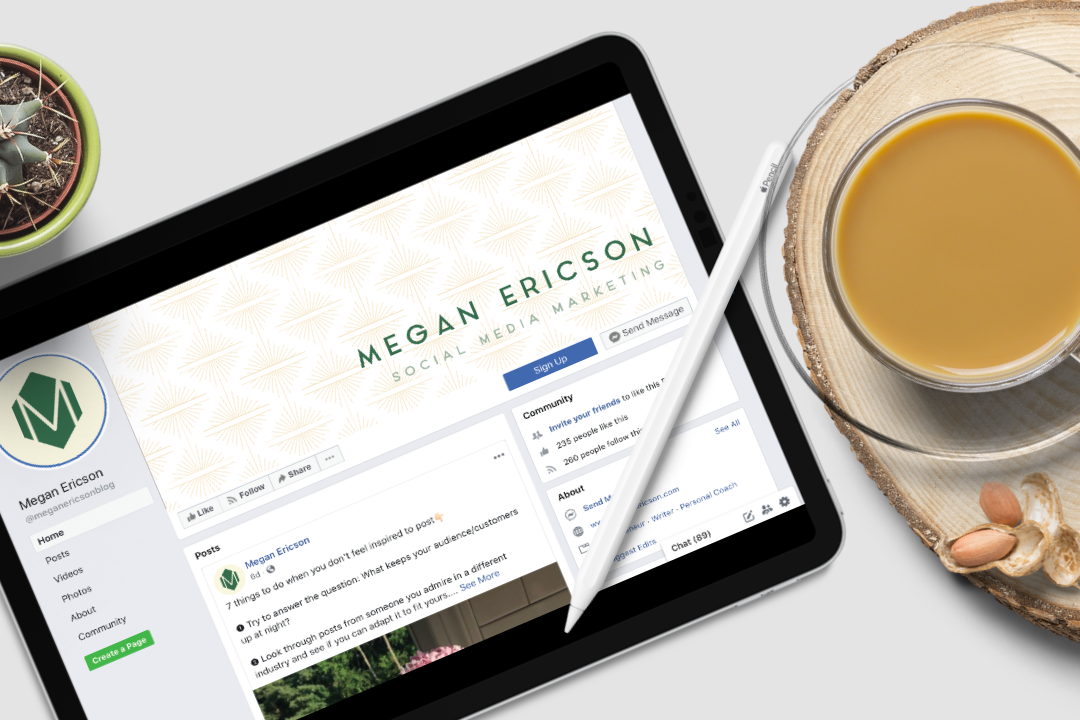
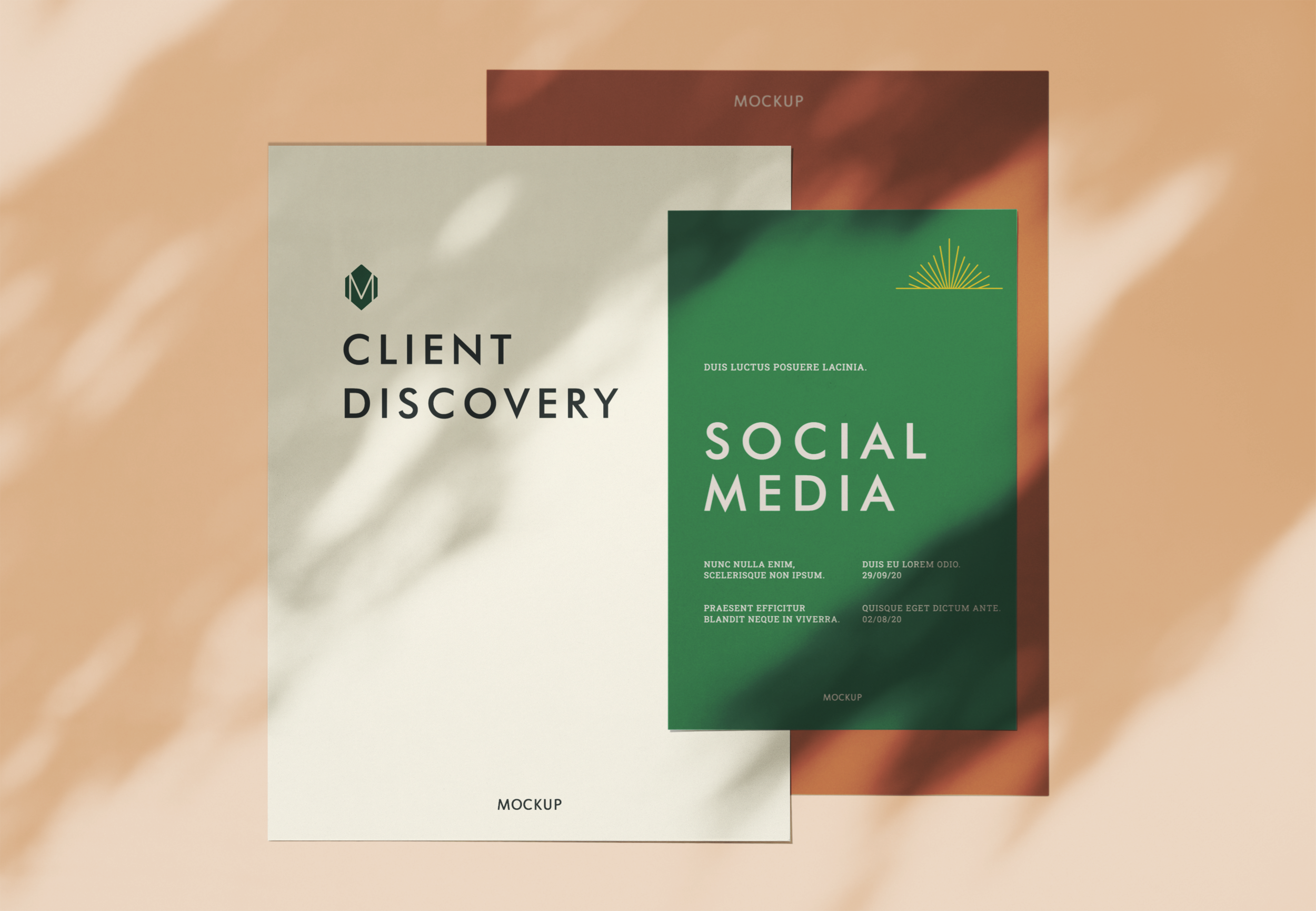
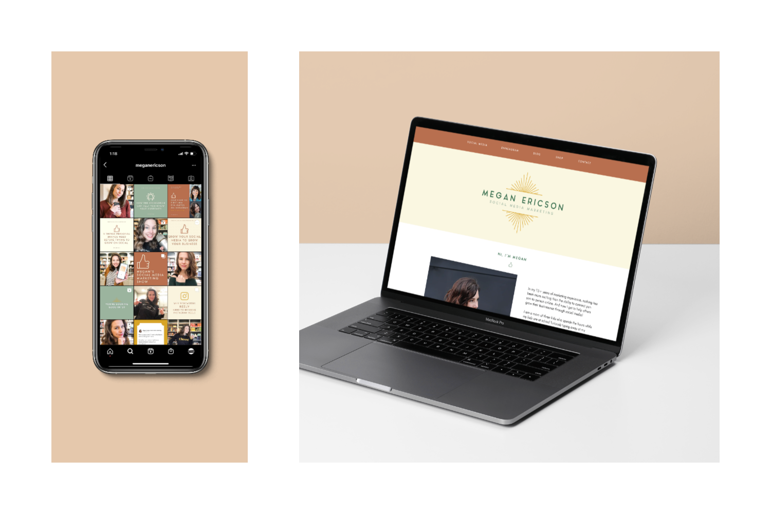
Below are a few examples of her brand applied to real-world scenarios mixed in with her brand assets and stock photos.


Brand Facts
Logo fonts: Aqua Grotesque, Sidecar
Brand Typography: Futura, Bebas Neue, Roboto Slab
Sent home with: logo suite, patterns, font system, color palette, mood board, custom social media icons, brand guidelines, social media shareables, social templates for IG/Stories and Facebook; podcast logo and promotional graphics for blog, YouTube, and social media.
I loved working on Megan’s brand. It’s fresh and a little funky, bold, and straightforward. She’s doing such great work educating and leading by example on social media, and, big news, her podcast recently launched!
Head to her website to listen/read/watch each episode and learn more about what she does for her clients. You’ll see how she’s using her brand assets on her own, too. Click the buttons below to navigate to Megan’s corner of the internet.
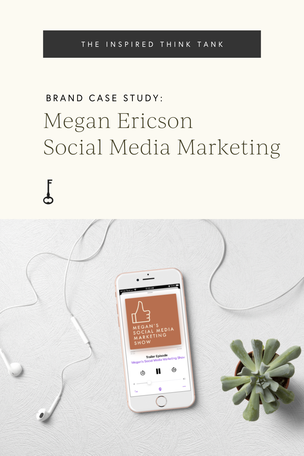
PIN ABOUT IT:


")

")


+ COMMENTS