Stock photos used to get a bad rap.
Maybe they still do in your world, but as far as I’m concerned, there’s more access to beautiful photography that can be on-brand now more than ever thanks to sites like Unsplash and Pexels, and of course the generosity of photographers from all over the world.
The question is, how do you create a collection of stock photography that feels consistent with the rest of your branding?
The answer: edit them.
If you don’t typically edit photos, or you’re used to simply adding a filter from Instagram or VSCO, editing feels a bit daunting. There are tons of options in any given photo editor, and making the right moves can mean the difference between an on-brand photo that blends in with your IG grid and a weird-looking and obvious stock photo that sticks out like a sore thumb.
A few tips to start:
- Make sure you know your brand style. Are you a light and airy brand? A bold and colorful brand? Chill and industrial? If you haven’t already, come up with a set of keywords to define your brand style. I rely heavily on interior design, music genres, and coffee shop orders to define a brand’s style. It’s much easier to find photos for a coastal-90’s hip hop-espresso non-fiction writer than it is for, say, a nice, warm, and happy non-fiction writer.
- Choose photos for both subject matter and editing style. Sometimes it’s easier to find stock photography that contains subject matter that matches your content, and then edit the photo to make it more on-brand. If you come across a photo you love, but it feels too dark to connect with your audience, you can still use it! It just needs to be edited a bit. And add photos to your collection that emulate the photography style that feels good to you so you have a baseline to match the rest of the edited photos to.
- Play with a photo editor to get to know what each feature does. Photography basics like exposure, white balance, saturation, and contrast will go a long way toward helping you adjust any given photo to better match your brand.
And if you’d like a realtime example of editing photos, check out this lil’ video I made for my Tiny Brand Design Schoolers all about editing photos to be on-brand. I walk through editing 4 photos to match two different color palettes, and it’s amazing what a little editing can do.
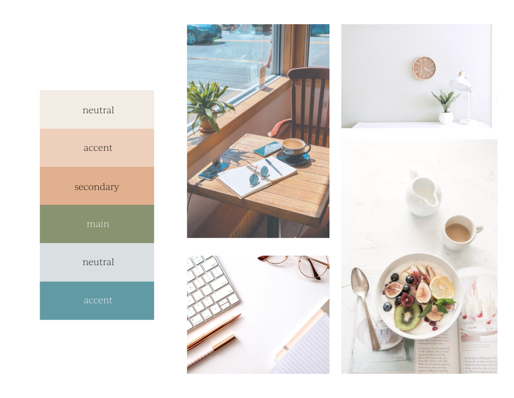
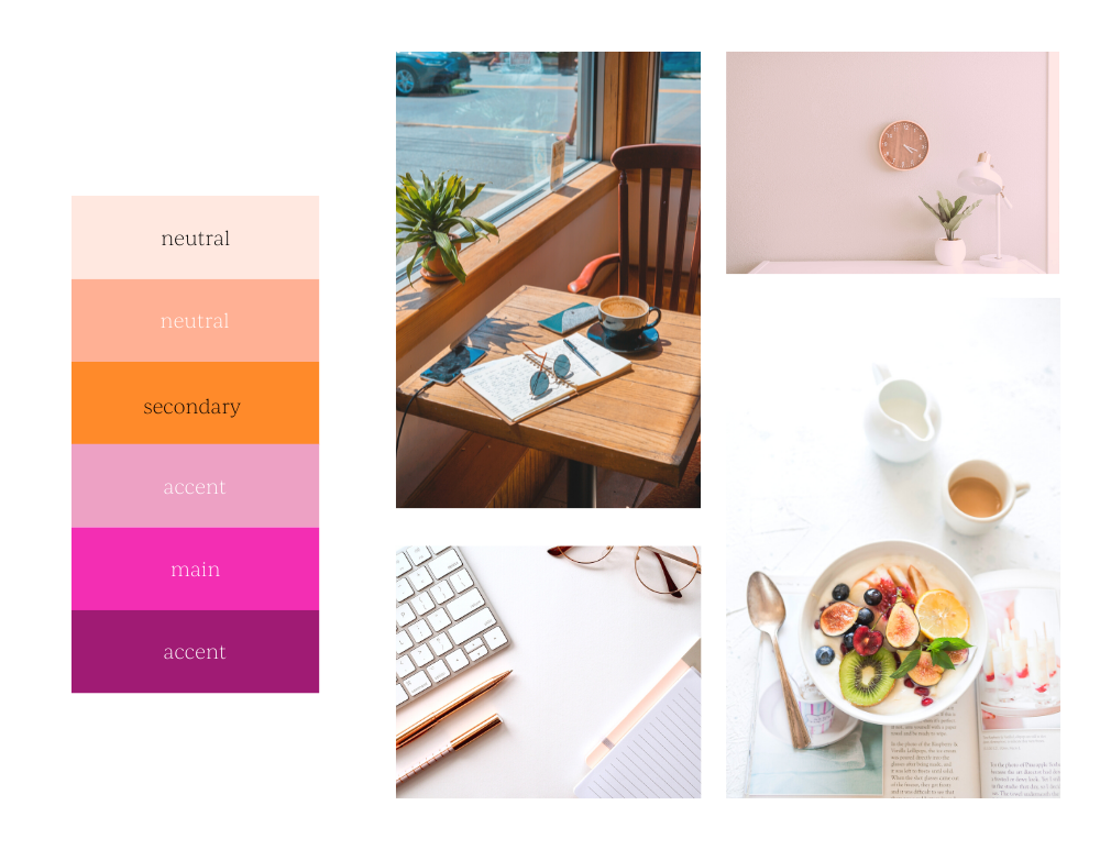
For example, here are two palettes and images to show you how the same photos can be edited in multiple ways depending on the needs of the brand. Isn’t the difference between the two insane?!


Need a place to get started looking for stock photos?
Try:
Shutterstock ($)
Fingers crossed you’re now excited to go edit photos to be on-brand instead of dreading it or feeling stuck with your photo choices. There’s so much potential to be had!
If you need help curating a collection of stock photos, I’ve got you covered. Tiny Brand Plus and Pro both come with stock photography collections — learn more here!

+ COMMENTS