
A common problem I see in DIY branding (my own stuff from the past included) is a focus on color and fonts as a means to an end rather than an opportunity to showcase your expertise. Choices are made for colors and fonts based on what is likable without much thought given to how it will be perceived by clients and customers.
Personally, I think branding is so frickin’ cool because it gives you the opportunity to create an *instant* connection with your audience. They’ll know within the first few seconds of looking at your IG feed or website if they want to spend time learning more about you.
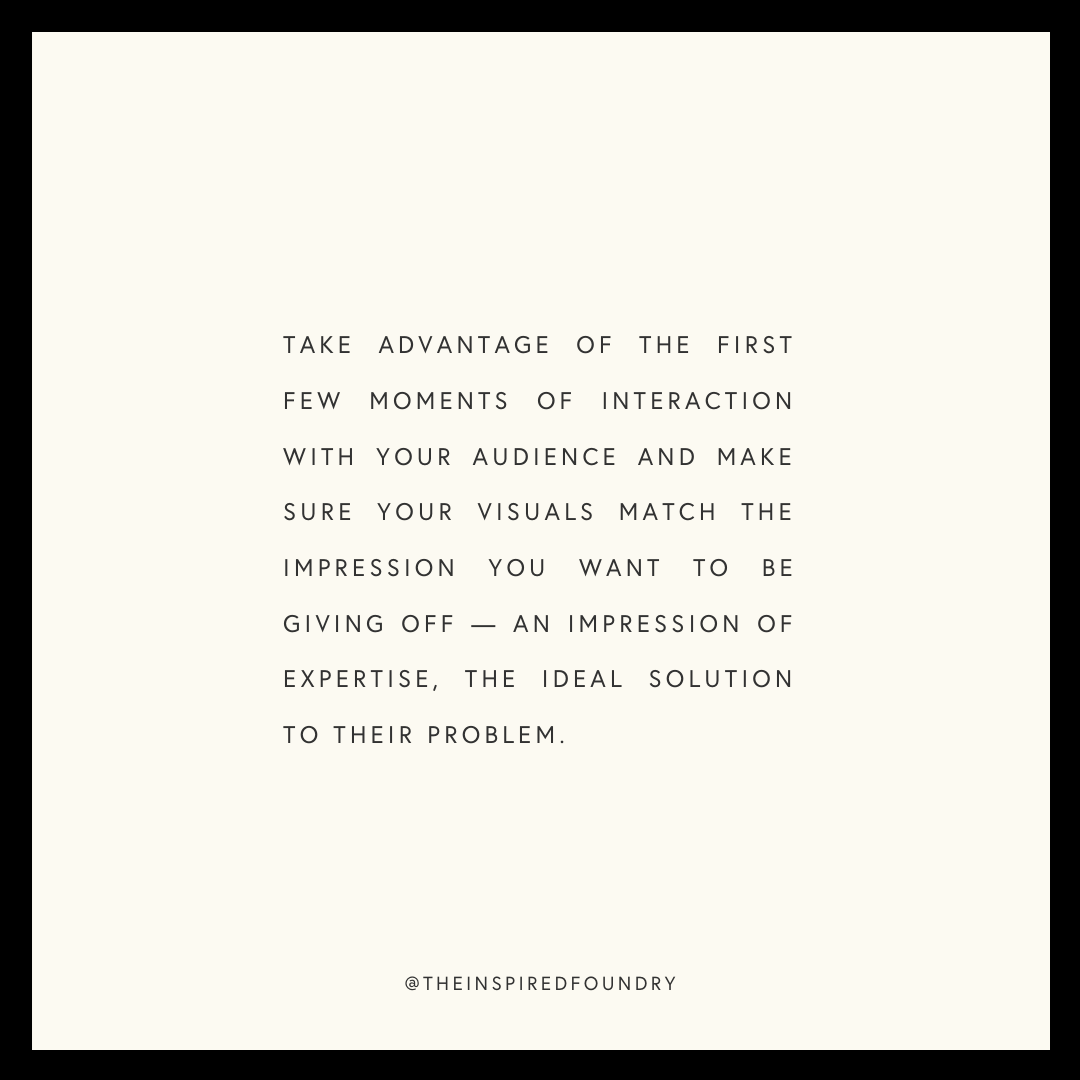
Take advantage of those first few moments of interaction with your audience and make sure your visuals match the first impression you want to be giving off — an impression of expertise, the ideal solution to their problem.
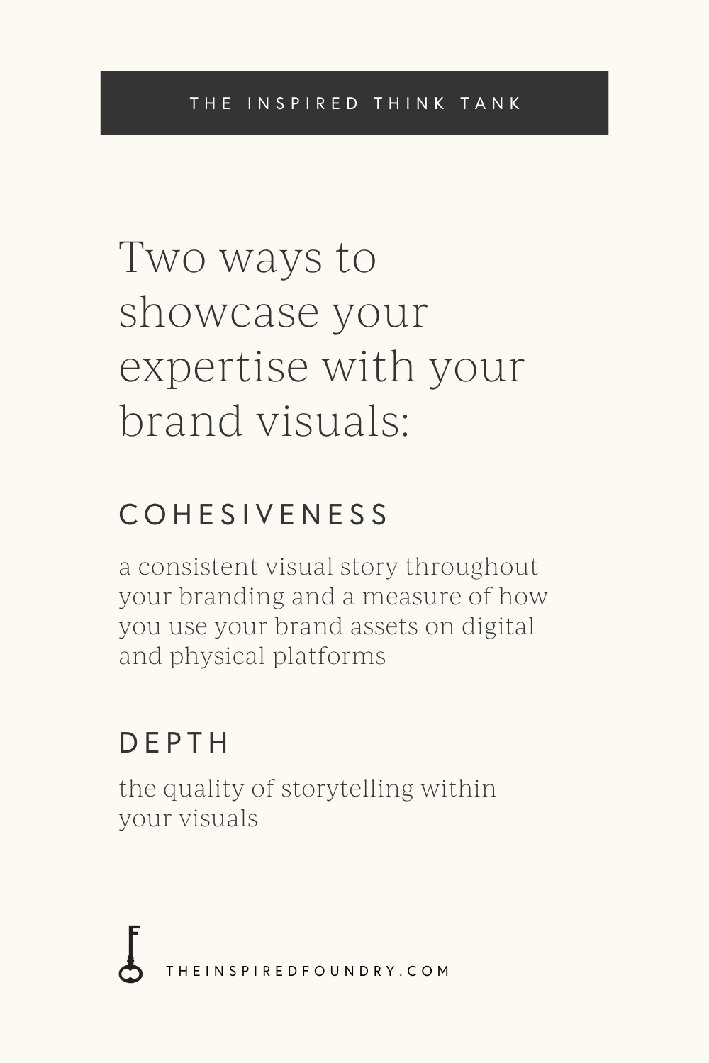
If you’re like, alright lady, but how do I do that, here are the two things I want you to think about with regard to your branding: cohesiveness and depth.
Cohesiveness
Cohesiveness refers to a consistent visual story throughout your branding and is a measure of how you use your brand assets on your digital platforms like social media, website, email newsletter, etc., and in the physical world through products, packaging, merch, and the like.
Some questions to ask yourself as you consider your own brand visuals:
Do you use the same color palette in your graphics as you do on your website?
Are your font choices the same, or at least similar, from your website to email newsletter to IG story captions?
Do the photos you share match your brand vibe? This can include both the content of the photos as well as the way they’re edited.
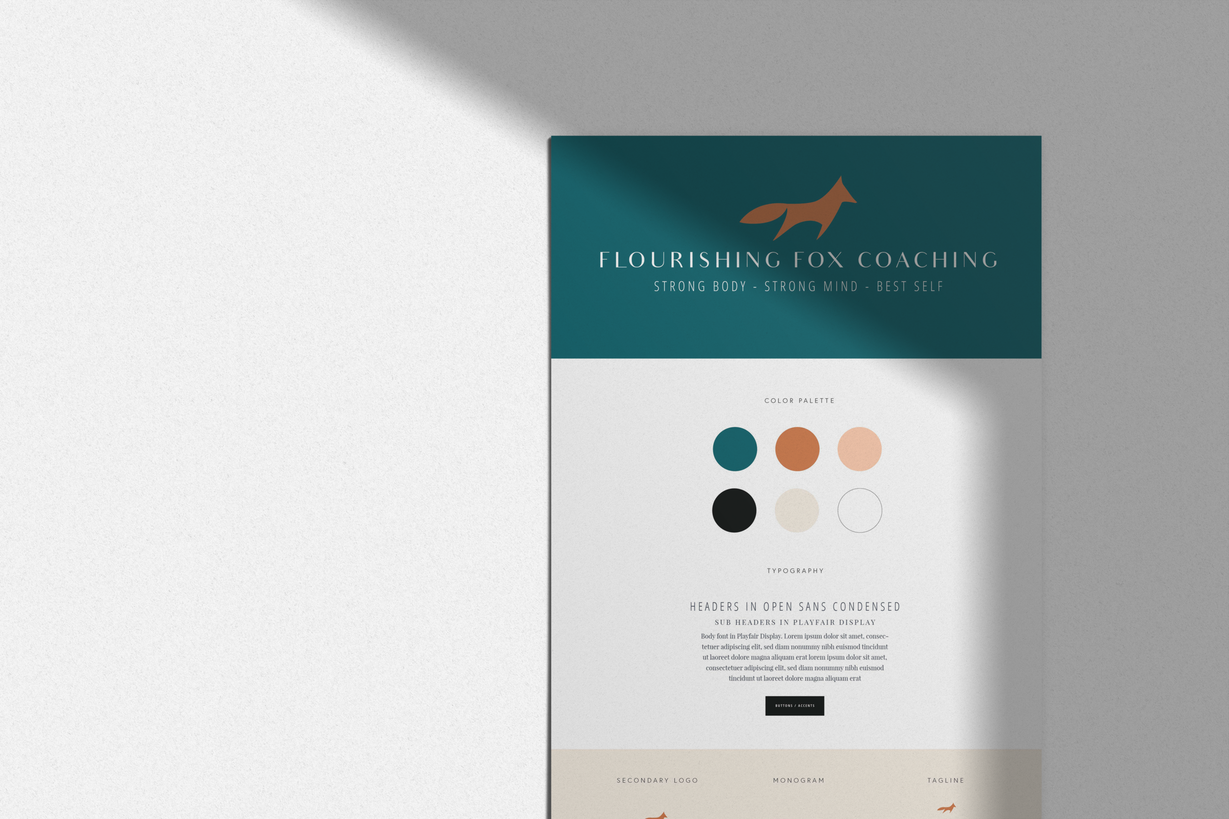
If you’re questioning the cohesiveness of your own brand, I highly recommend creating a brand style board or visual guidelines document for yourself that highlights important pieces of maintaining a consistent brand: color palette, fonts, logo(s), brand keywords, and examples of photography or vibe within a mood board.
This gives you one place to reference when you’re creating social media graphics, editing photos, and creating your email newsletters, or editing your website. No more recreating the wheel with each new graphic! You can include the HEX codes for your color palette — the color code needed for recreating specific colors in the digital space, usually found with a pound sign ( followed by six characters — so you have those easily available for reference, too. You can see the kind of brand board I create for my clients in the image above.
If you do a lot of social media graphic creation, I’d also recommend using a platform like Canva that allows you to create a “Brand Kit”, a place within your account that captures your color palette, preferred brand fonts, and any logos or elements you use frequently so you can easily access them as you design.
Depth
The second aspect of projecting your expertise through your brand visuals is depth. Depth looks at the quality of storytelling within your visuals.
A few questions to ask yourself about your own brand depth:
Does your main logo have variations that complement a wide variety of spatial needs, like a circular IG profile photo vs a landscape website banner?
What’s the meaning behind your visuals? Are bits and pieces of your own story weaved into your logo designs?
What kind of thoughtful details will someone find as they experience your brand throughout their lifetime as a client or customer?
When I’m working with a client on crafting a custom brand identity, the pieces of their story I’m most interested in are the things they might overlook or wouldn’t have considered including in their branding.
For instance, I just wrapped up a project for a husband-wife wedding videographer team out of Michigan — we created a unique brand identity based on their love of capturing the real and intimate details of a wedding day and creating heirloom-quality films for their clients.
So I asked them about their own wedding day, the intimate details they loved about their own experience (I was actually there for their wedding, but I asked them about it anyway!). They reminded me about their outdoor reception on the grounds of a Girl Scout Camp, dancing under the starlight, surrounded by lush forest growth and what Michigan’s UP seems to be known for: ferns.
Everything from their wedding invitations to table centerpieces included ferns and nature elements, so I ended up creating a small fern icon to be the centerpiece of their brand. It’s a nod to their own wedding day and will become a small visual detail that makes the brand both memorable and a clear indication of their commitment to capturing the same kind of details on their clients’ wedding day.

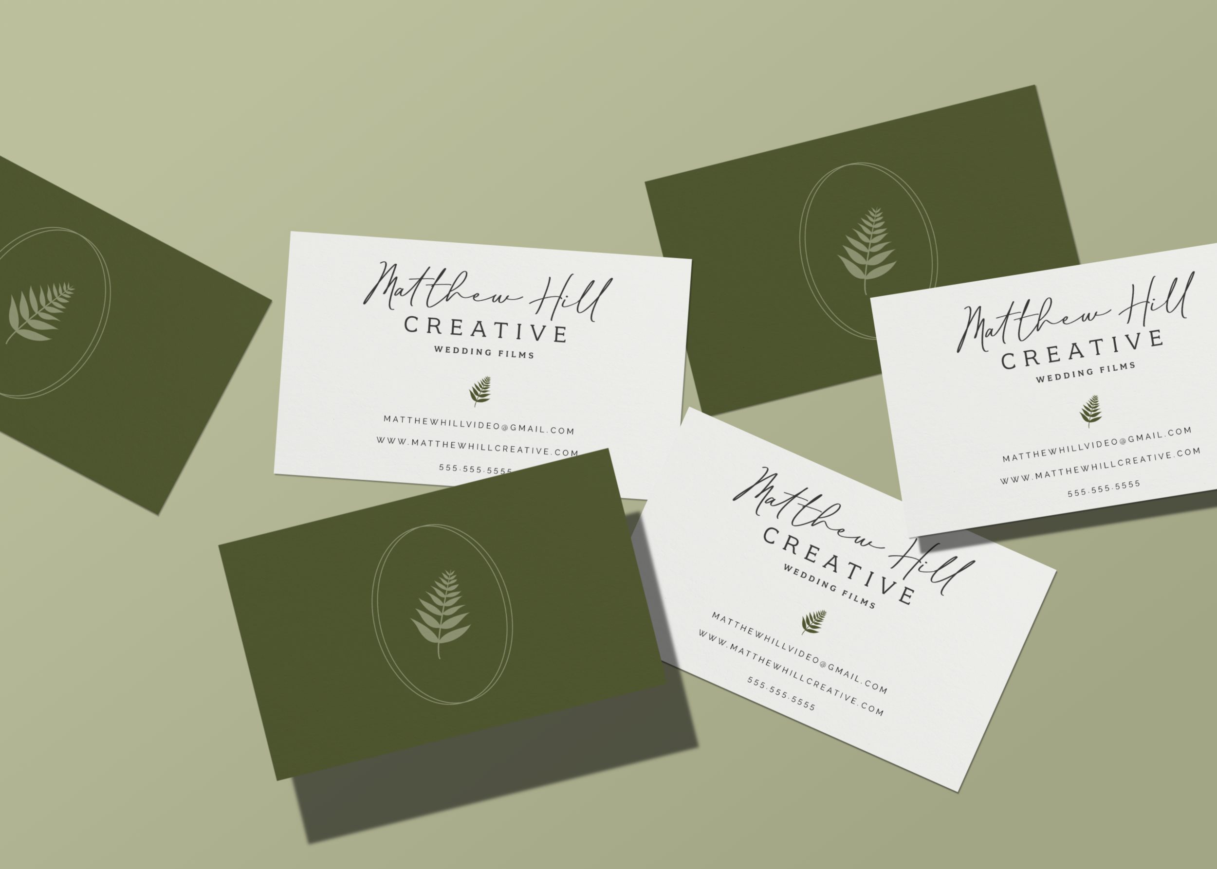
I imagine it will be used in many different ways throughout their website and social platforms — as a watermark, as a brand representative when their main logo won’t fit, probably as a sticker (I know for a fact that they love branded merch!), as the first little piece of their brand that future clients will gravitate towards as they look for someone who has an eye for detail and meaning to capture their special day.
This is depth. Stories behind the visuals.
Now, stories don’t mean much if there’s no way to actually tell them with words. So I encourage my clients, and you, to put up some sort of explanation on your about page, or worked into your homepage copy, that tells the story behind your visuals. Perhaps it’s an Instagram caption or IG highlight on your profile, an interactive “click here” experience on your website or a note tucked into purchased products.
However it makes sense for you to showcase the tiny details that make your brand special and make you look like the expert you are, find ways to ensure they are front and center within your brand visuals.
Figure out how to express your story visually and then keep showing it off.
Be consistent with your usage of color and fonts, share images that reflect your ideal client’s lifestyle and the vibe of your brand, and you’ll be well on your way to ensuring your brand has both cohesiveness and depth.
And if you need help with any of this, feel free to shoot me an email with your questions! I’d love to help bring more cohesiveness and depth to your brand.
PIN ABOUT IT:


")

")


+ COMMENTS